How to Make a Scatter Plot: A Comprehensive Guide
7 min read
In this guide we will explore what a scatter plot is, and how you can create it to make decisions in project management.
What is a Scatter Plot?
A scatter plot, also known as a scatter diagram or scatter graph, is a type of data visualization that displays values for typically two variables for a set of data. The data is displayed as a collection of points, each representing the values of the two variables. One variable is plotted along the x-axis, and the other along the y-axis. This straightforward tool addresses one main question: Are two variables related to each other? If they are, is the relationship direct or inverse?
How to Interpret a Scatter Diagram
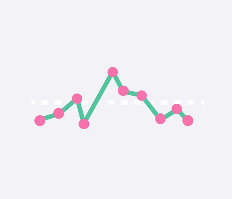
Interpreting a scatter diagram involves looking at the direction of the relationship between the variables:

- No Correlation. Points are scattered randomly with no clear pattern.
- Positive Correlation. As one variable increases, so does the other, forming an upward slope.
- Negative Correlation. As one variable increases, the other decreases, forming a downward slope.
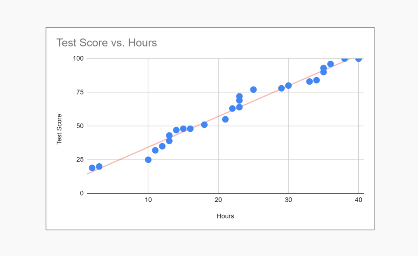
Scatter Plot Example
Consider a data set where we plot students' hours of study against their exam scores. Each point on the scatter plot represents an individual student's hours of study (x-axis) and their corresponding exam score (y-axis).
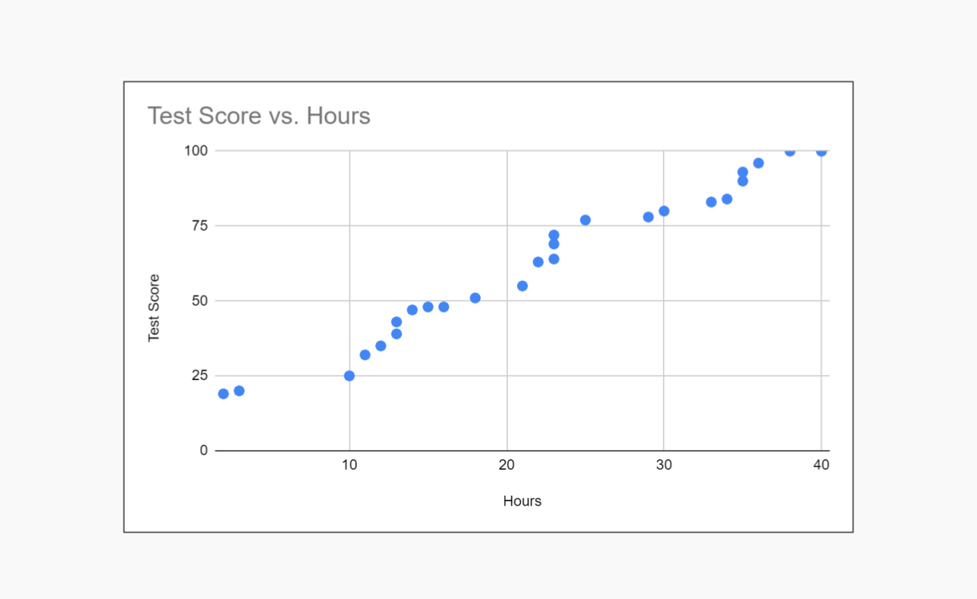
If most points form an upward trend from the bottom-left to the top-right, it suggests a positive correlation: as study hours increase, exam scores tend to increase. If the points are scattered without a clear pattern, it suggests no correlation between study hours and exam scores.
How to Make a Scatter Plot in Excel
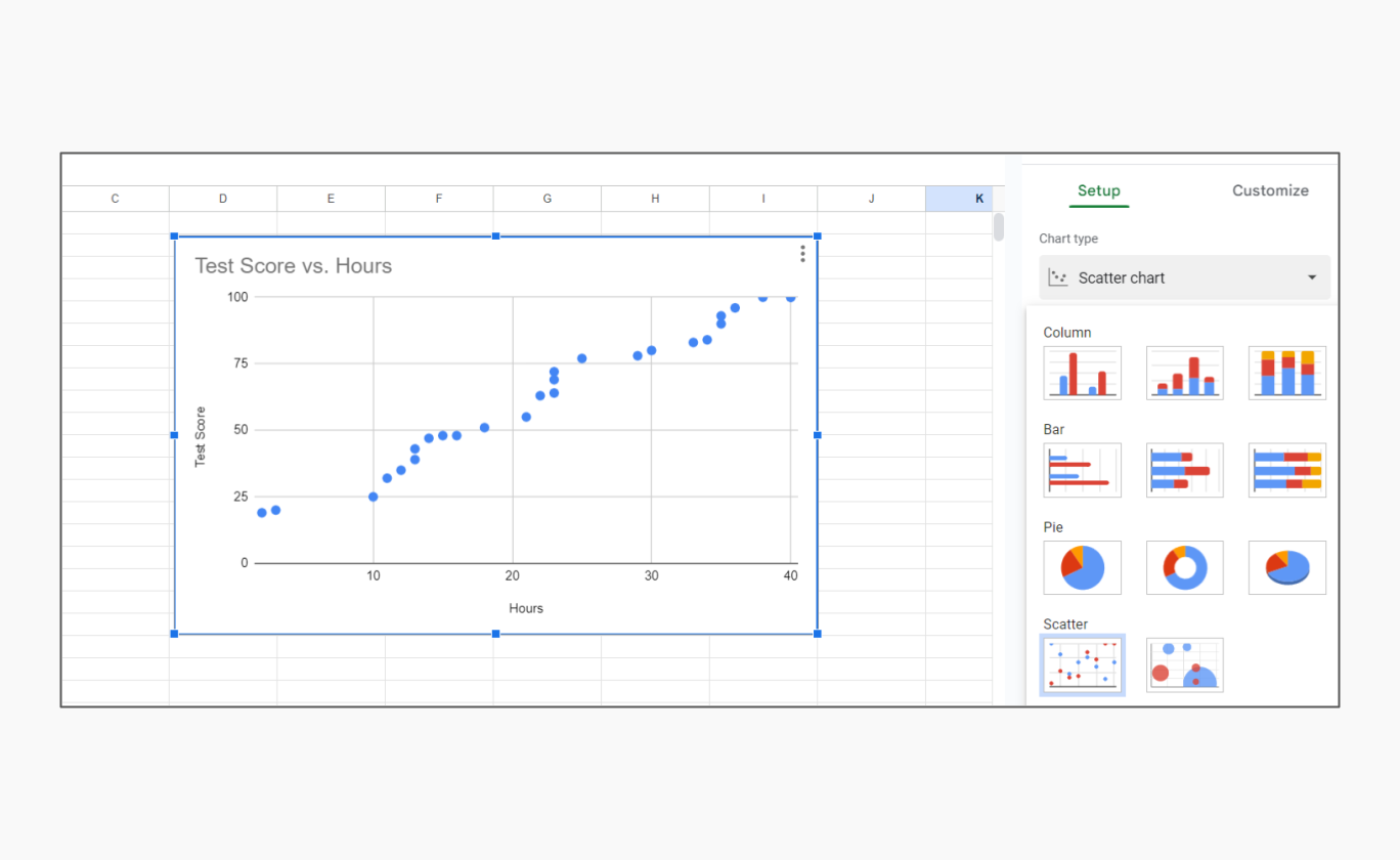
Creating a scatter plot in Excel or Google Sheets is straightforward and can be done using the following steps:
- Input Your Data. Enter your data into two columns. For example, if you are analyzing the relationship between study hours and test scores, input study hours in one column and test scores in the adjacent column.
- Select Your Data. Highlight the data range you want to plot.
- Insert Scatter Plot. Go to the Insert tab on the Excel ribbon. In the Charts group, select Scatter and choose the desired scatter plot style.
- Customize Your Plot. You can customize the scatter plot by adding chart elements such as titles, axis labels, and trendlines. This can help clarify the relationship between the variables.
For those who prefer online tools, using a scatter plot maker or scatter plot calculator can be an efficient alternative. These tools often come with built-in features to identify trends and correlations, making them ideal for quick analysis.
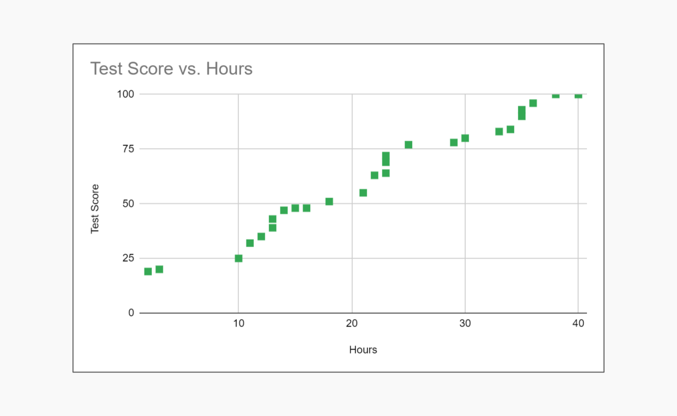
Customizing Your Scatter Plot
Scatter plots come with several customization options, including:
Marker types and sizes
Adjusting the shape and size of the points for better visibility.
Trendlines
Adding a line to represent the general direction of the data (linear, exponential, etc.).
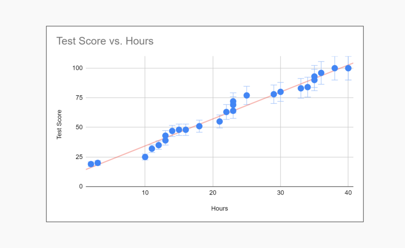
Error bars
Including error bars to show variability in the data points.
When You Should Use a Scatter Plot
Scatter plots are particularly useful when you need to:
- Identify relationships. Determine if there is a correlation between two variables.
- Detect trends. Observe patterns or trends in the data.
- Spot outliers. Identify unusual data points that deviate from the general pattern.
- Analyze data distribution. Examine how data points are distributed across two variables.
Potential Issues When Using Scatter Plots
While scatter plots are powerful tools, several issues can arise:
- Overplotting. When too many points overlap, making it difficult to discern individual points or patterns. This can be mitigated by using transparency or adjusting point size.
- Misleading scales. Inconsistent or misleading axis scales can distort the interpretation of the data relationship.
- Ignoring context. Failing to consider the context of the data can lead to incorrect conclusions about correlations and causations.
- Overfitting with trendlines. Adding trendlines that are too complex for the data can create misleading representations of the relationship.
Conclusion
Scatter diagrams are powerful tools for identifying relationships between variables. They are widely used in various fields such as economics, biology, engineering, and social sciences, quality management to visually examine the relationships between variables. They help in identifying trends, patterns, and potential causations.
However, always critically evaluate the logical basis of the relationship depicted to avoid drawing erroneous conclusions from coincidental data patterns.
About the Author
Sergey Koshevoy is the CEO of Planyway and a seasoned product manager, bringing a wealth of experience in project management and team collaboration tools. A fan of quality management techniques, Sergey is passionate about creating intuitive and efficient solutions that help teams work smarter and achieve their goals.