How to create the best dashboards in Jira: a no-fluff guide

Most Jira dashboards start with good intentions. But more often than not, they end up as bloated walls of gadgets, outdated metrics, and charts nobody can rely on, including the stakeholders. In the end, your team gets back to manual updates and status meetings, because they just don’t have the time to hunt for the right answer in the dashboard. And then there are also certain limitations in the out-of-the-box reporting features of Jira. Not an ideal situation.
Let this ultimate guide save you from endless trial and error. We will reveal the most efficient methods to create sticky Jira dashboards that deliver immediate, accurate answers across your entire portfolio.
TL;DR
- Jira's native visualization tools are designed to give you an operational overview. That means you'll want to structure your views intentionally so they reflect not just what needs to ship, but who actually has the bandwidth to ship it.
- Avoiding a cluttered "gadget graveyard" requires strict adherence to role-based design principles; every metric displayed must map directly to an actionable decision rather than merely surfacing raw ticket data for the sake of visibility.
- Achieving true cross-project portfolio management frequently breaks the boundaries of standard dashboards, making it essential to leverage specialized capacity planning plugins to maintain alignment and predictability without constant manual intervention.
What is a Jira dashboard?
A Jira dashboard is a configurable workspace that highlights the most important signals about how a team or project is doing. You get a single screen where widgets turn raw Jira data into clear, at‑a‑glance views. Most of these widgets are driven by saved JQL filters that determine which issues they draw from. Certain agile widgets can also use boards, sprints, or entire projects directly as their underlying data source.
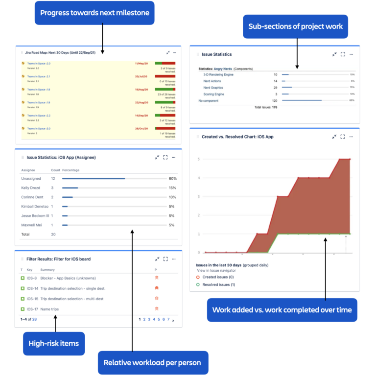
Source: atlassian.com
Once you’ve created a dashboard in Jira, it automatically refreshes the data shown in its gadgets and reports every time you reload the dashboard. You can also configure some views to refresh at regular intervals to display the latest issue data, providing near real-time visibility into your work without requiring manual updates. That doesn't mean the work stops there — you’ll still want to maintain the filters and the layout as your projects and teams evolve.
While this automated syncing represents the ideal operational rhythm, seasoned Jira administrators know that complex queries, network latency, or a massive Jira instance can occasionally make this auto-refresh feel sluggish, meaning teams must optimize their setups for performance.
Dashboards vs. reports vs. board in Jira
Inside Jira, you will find three main visualization tools that complement each other. As a rule, you'll often start with a dashboard to identify a potential problem. From there, you might click through to a board to manage the work, and then run a report to analyze the root cause.
| Feature | Purpose | Best for | Key components |
| Board | Managing daily workflow, tracking active tasks, and unblocking the entire team. | Daily standups, monitoring an active sprint board, and moving work through stages. | Columns, swimlanes, WIP limits, individual Jira issues. |
| Dashboard | Providing a customizable overview of multiple key metrics in a single dashboard screen. | Stakeholders, PMs, and scrum masters who need quick status checks. | Gadgets, pie chart, JQL filters, text blocks. |
| Report | Deep-dive analysis of historical performance, velocity, and forecasting. | Retrospectives, capacity reviews, and auditing overall progress. | Sprint report, burndown charts, velocity graphs. |
Gadgets and what they can do for your Jira dashboards
At their core, Jira dashboard gadgets are modular data blocks. These are distinct lenses that pull specific information from your database and translate it into consumable visual formats. Gadgets transform an overwhelming backlog of raw information into focused insights, allowing a logged-in user to instantly grasp the context of their work.
Out of the box, Jira provides a broad set of dashboard gadgets you can use on Scrum dashboards, including sprint-specific gadgets like Sprint Burndown and Sprint Health.
The Sprint Burndown gadget tracks the completion of tasks against the expected timeline of the sprint. It visualizes the remaining effort and quickly flags if the team is falling behind their commitments, helping managers track progress and identify bottlenecks before the sprint ends.
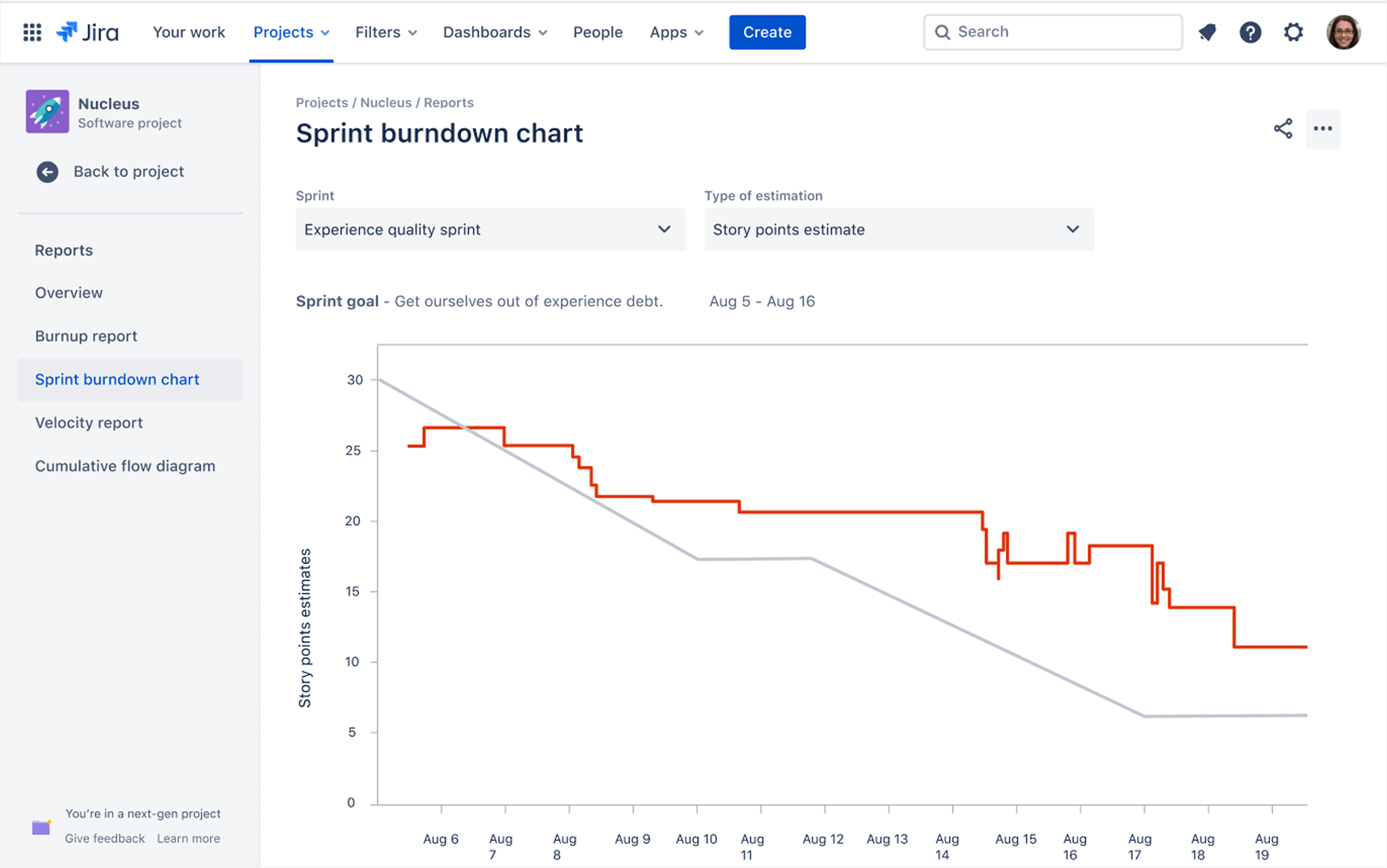
Source: atlassian.com
The Sprint Health gadget serves as a high-level weather report for your active sprint. It provides a quick summary of essential data points like time elapsed, work completed, and scope changes, giving leaders an immediate read on team performance without digging into individual tickets.
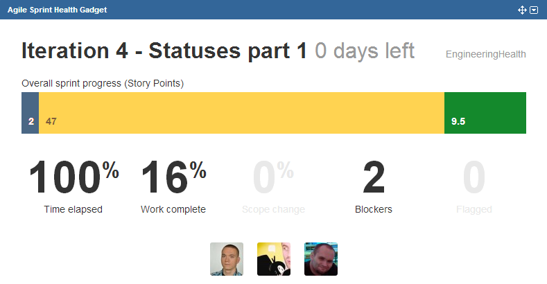
Source: atlassian.com
Outside Scrum, Jira also offers a set of universal gadgets that are based on filters and JQL queries, such as Filter Results, Assigned to Me, Two-Dimensional Filter Statistics, and others. You can use them on any dashboard, including Scrum, Kanban, or methodology-agnostic ones.
Native gadgets get the job done, but on closer inspection, they can feel static because they mostly provide fixed, point-in-time snapshots. They also don’t give enough actionable data when you need to manage complex dependencies, balance workloads, or forecast long‑term capacity across multiple projects.
If you need interactive what‑if planning and resource‑level capacity modeling across multiple projects, you’ll need to extend Jira with Advanced Roadmaps or specialized project planning apps.
Putting together a Jira dashboard in 6 steps
The best Jira dashboard isn't meant to show everything. It's designed to show the right things to the right people and skip the noise. Building one requires intention, not just adding every available widget to the page.
Here's a step-by-step guide on how to create a dashboard in Jira:
- Log in to your Jira Cloud or data center environment.
- From the top navigation bar, locate the dashboards dropdown. Clicking this opens your directory of views.
- Select the "Create Dashboard“ option. If you simply want the standard experience, you can select the default option to set up a default dashboard as your starting point.
- Name your board and set initial permission schemes. Once saved, you land on a blank page. You can easily change the structure to your preferred layout (like a three-column or a 30/70 split) depending on the density of the information you plan to display.
- Click the Add Gadget button to open the library of useful gadgets. For example, adding a pie chart gadget lets you visualize data by assignee, allowing you to show percentages of workload distribution for each team member.
- Drop gadgets onto the page and configure their specific settings, such as linking them to a saved filter to ensure it only displays issues relevant to your current company goals.
💡 Bonus tip: If you want to save time and create an effective view quickly, Jira itself offers a library of templates. You can find pre-built configurations that cover common use cases in the official Atlassian dashboard templates guide.
Pro tips on how to get more out of your Jira dashboards
Optimizing your environment is about subtraction as much as addition. A good Jira dashboard acts as a focused operational lens, while a bad Jira dashboard functions as an unreadable dumping ground for every metric imaginable.
If your Jira dashboard doesn’t tell a clear delivery story, strip it back
When a Jira dashboard doesn’t tell a clear delivery story, it often signals that it is trying to surface too many metrics at once. Too many gadgets can quickly lead to cognitive overload and noticeably slower page loading times. As a rule, the most effective dashboards tend to show only the data that supports a specific business decision, while cluttered dashboards end up hiding critical insights under a mountain of noise.
Blame JQL before you blame the dashboard
The underlying JQL filters often muddy the waters more than the number of gadgets. If those filters are overly broad or rely on non‑indexed fields, each gadget has to work harder to retrieve and render data, which quickly adds up. In practice, teams that regularly review and simplify their core filters often see much bigger performance gains than teams that only rearrange gadgets or delete dashboards.
Replace hardcoded queries with reusable filters
A common pitfall is relying on fragile, hardcoded queries that only one person understands. Well-structured saved filters and clear naming conventions let you reuse the same JQL across multiple gadgets and dashboards without altering the underlying issues. This makes it much easier for stakeholders to switch between perspectives, such as isolating critical customer requests or narrowing down to a single team — no need to spin up a new dashboard for each scenario.
Keep JQL queries lean and efficient
Once you know JQL is part of the problem, the next step is to reduce its complexity. When a single heavy query powers one or more dashboard gadgets, any inefficiency in that JQL can slow down the entire page and delay how quickly your Jira data appears. Atlassian itself recommends keeping queries lean by limiting their scope to the relevant projects and date ranges, avoiding troublesome fields and functions, and breaking large conditions into smaller, reusable saved filters. Following that advice has a much bigger impact on how fast your Jira data loads than simply worrying about how many characters your JQL contains.
Leverage custom visuals over text lists
Endless lists of tickets are exhausting to read and make it harder to see trends. Replacing simple text lists with visual aggregations like bar charts or specialized custom charts helps stakeholders immediately spot patterns, such as a drop in customer satisfaction or a spike in blocked issues, making the board an actual game-changer for transparent communication.
Supplement with text and documentation as context for metrics
Numbers without context often mislead or trigger unnecessary debate. Using rich text blocks to add notes, explanations, or links to relevant Confluence pages turns a simple collection of charts into a coherent narrative about project status and trade-offs.
How to share your Jira dashboards
Because visibility in Jira is multi-layered and easy to break unintentionally, dashboard sharing often turns into one of the biggest headaches for users and a common reason teams fall back on frozen-in-time PowerPoints. But there are some fairly straightforward workarounds.
Sharing the dashboard internally
When managing sharing dashboards protocols internally, you must ensure that the viewer has permissions not just for the dashboard itself but also for the underlying projects and filters feeding it.
If a user lacks access to the base project or the saved filter, they will encounter broken links or bad charts that show empty or partial data. Administrators typically utilize user groups and roles to grant access systematically instead of adjusting permissions one user at a time.
Sharing the dashboard externally
By design, Jira dashboards are meant for licensed, logged-in users inside your instance. The biggest issue with sending dashboards to someone outside your team is that dashboards can’t really be shared externally unless the users have Jira accounts. While you can technically expose some views to anonymous users, this strict security model protects your data but rarely aligns with corporate security policies and often frustrates client communication.
The simplest low-cost workaround is Confluence. By embedding your Jira reports and selected issue views directly into Confluence pages via macros and smart links, you can create a secure, client-facing portal. Confluence allows for more granular, external-friendly permission settings, enabling you to share updates and explain how you plan to resolve customer requests without granting direct access to your internal environment.
What to do if you need live, reality-aware Jira dashboards
In Jira, dashboards are issue‑ and task‑centric by design. They show everything from issues and statuses to filters (JQL) and sprint or task progress, but they don’t provide a full picture of the living state of the project itself. A sprint may look healthy on paper, but in reality, one developer can be stretched thin, while another is underloaded. An epic might seem almost there, even though what’s left is usually the hardest, most time-consuming, and riskiest part of the work.
Planyway adds a live planning and reporting layer on top of Jira, turning your Jira work into continuously updated, cross-project timelines that actually reflect how your projects are progressing. Basically, you get real-time, executive-ready "dashboards" across projects, timelines, capacity, and execution — all in one place, fully synced with Jira and representative of what's happening across projects.
- Cross-project portfolio view. In Planyway, you can see all your Jira projects in one, live portfolio view grouped by the way you work — epics, projects, initiatives, or quarter — with key milestones and dependencies visualized from your Jira data.
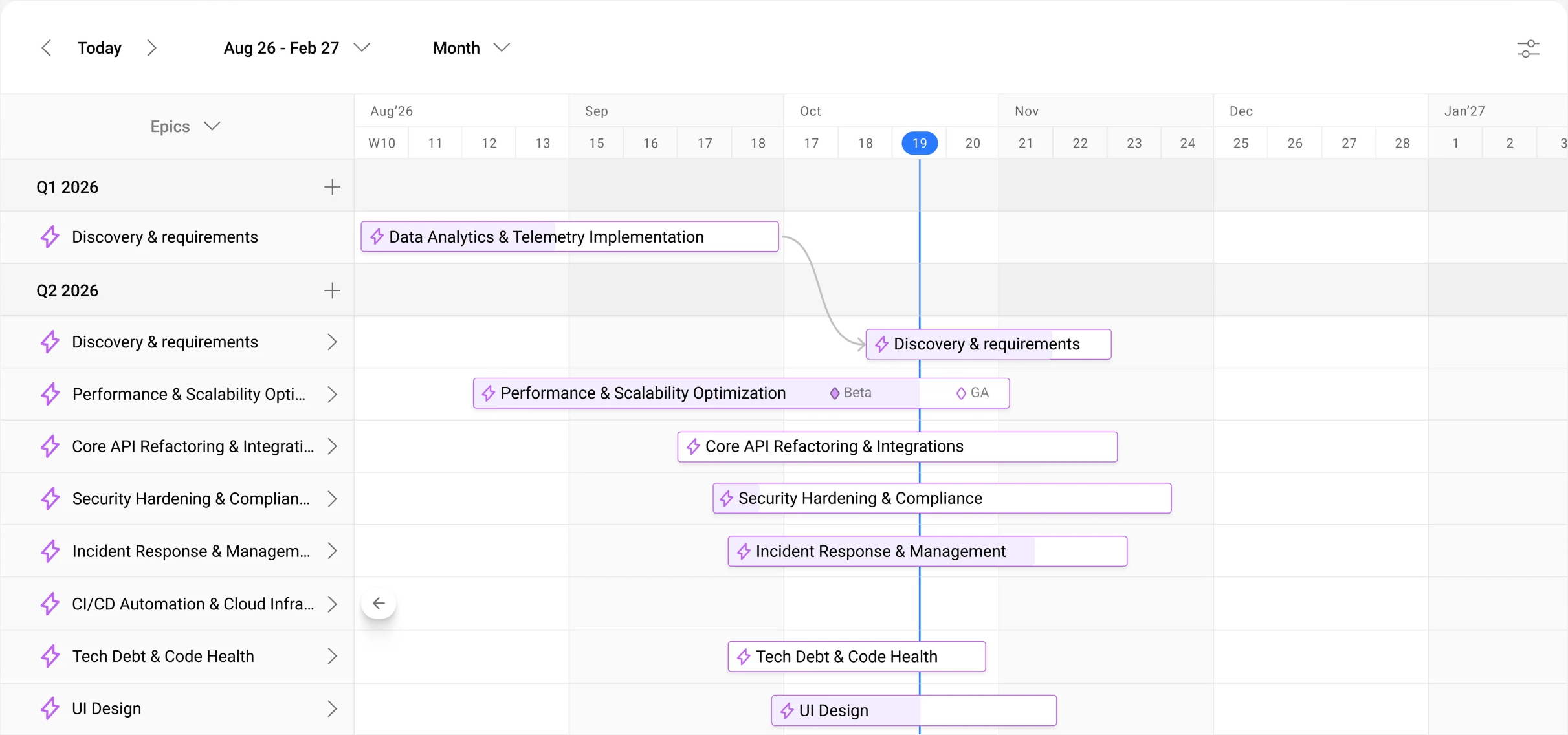
- Team capacity & workload. Planyway also gives you clear visibility into team and individual capacity alongside actual workload across projects.
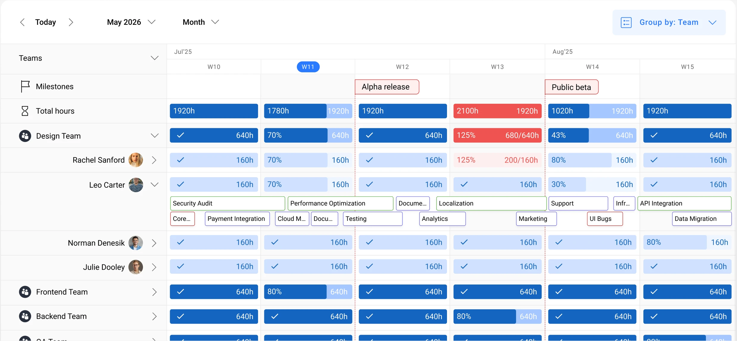
And if you need dedicated, ready-to-share reports, Planyway turns live Jira data into analysis-ready dashboards for workload, tracked time, timesheets, and planned vs actual effort. All dashboards are easily exported to Excel or CSV with all your current filters and sorting preserved.
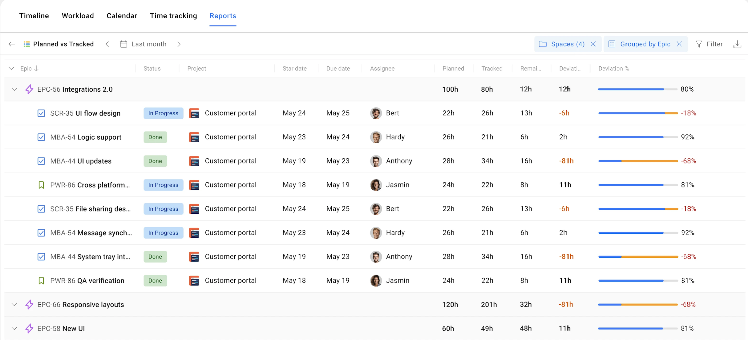
So, Jira dashboards show what is happening (status, progress, metrics), while Planyway shows how that work is scheduled and delivered over time (who does what, when, and with what capacity).
Dashboards don’t lie (but they may not tell the whole truth either)
Jira dashboards faithfully reflect the data and structure you give them, but that alone doesn’t lead to better decisions. The real value appears when clean JQL, well-designed dashboards, and clear audience-specific views are tied to the operational delivery reality.
While Jira doesn’t natively bring this planning layer together, you can get there by extending dashboards with a planning layer like Planyway. Planyway adds a portfolio- and capacity-aware planning layer on top of your Jira dashboards, which makes them more actionable and true to real-world delivery.


FAQ
Jira dashboards are not designed for true real-time, second-by-second tracking. It is a visual instrument made for collating key metrics, progress, and trends in one place. Using them as a live transaction monitor can lead to performance issues and lag for users. For truly dynamic, continuously updating views, teams usually rely on dedicated planning or timeline tools like Planyway.
Jira dashboards most often end up showing blank or misleading information when the data pipeline behind them is disrupted by permissions or faulty JQL. When a viewer lacks access to the source projects or filters, Jira intentionally withholds the corresponding records, leaving gadgets looking empty. And if a saved filter is removed or silently rewritten, any gadget wired to it will start surfacing errors or half-broken views instead of the expected results.
Jira dashboards are generally not accessible to the public because of the default security model. Only licensed, authenticated users have access to Jira instruments within the instance. There are ways for administrators to configure external or anonymous access, but that typically exposes internal data in ways that conflict with corporate security policies. As a result, organizations prefer to share sanitized views via exports or embedded reports in Confluence pages with controlled access.
Jira does support cross-project dashboards by using JQL filters that pull issues from multiple projects or portfolios into one combined view. Gadgets such as Two-Dimensional Filter Statistics or Filter Results can then present this information on one screen. However, this is a fairly limited workaround, as it doesn’t visually map cross-project dependencies or show shared resource capacity in a meaningful way. A truly complete picture can be achieved with the help of dedicated portfolio tools, such as Planyway, that are built to visualize timelines, dependencies, and team workload across many projects at once.