Flowchart examples and diagram types: a practical guide for project managers
10 min read
As a project manager or analyst, you rely on flowcharts as the visual GPS for your project. Instead of combing through a wall of text or drilling down into spreadsheets, you get a single diagram where the sequence of steps is clear and helps you identify bottlenecks before they turn into delays.
Being a project manager myself, I know there's a lot that goes into creating an effective flow chart beyond drawing boxes and arrows. Building a good one is a real skill. In this article, we'll cover the main types of flowcharts, when to use each one, and share practical tips from real project experience.
TL;DR
- A flowchart is a visual representation of the information flow that helps make an invisible process visible and therefore fixable.
- Different types of flowcharts answer different questions like "what are the steps," "who owns what," "why did this break”. Their purpose is to bridge the gap between planning and execution.
- A flowchart that tries to capture every detail in one view communicates nothing. The goal is to split the complex process into understandable and readable layers so the whole picture clicks at a glance.
What’s a flowchart?
A flowchart is a visual representation of a workflow, process, or system. It uses standard shapes and symbols like circles, rectangles, and arrows to map out steps, decisions, and handoffs. Each box in a flowchart represents a single process step, making even complex workflows easy to scan. This way of mapping a process creates a shared reference point that the whole team can use: PMs see the sequence, analysts validate the logic, and everyone understands what comes next.
What are the common flowchart symbols? A quick reference
You can diagram almost any process, using just six fundamental flowchart symbols, which you can see below.
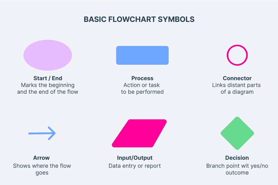
Here's a quick debrief:
- Ovals mark beginnings and endings.
- Rectangles are for processes or operation steps. It is the most common element in any flowchart.
- Diamonds are where the flow branches: yes or no, approved or rejected, pass or fail.
- Arrows show the directional flow from one step to the next.
- Parallelograms stand for inputs and outputs, such as data entry forms or generated reports.
- The small circle is a connector, used when your diagram spans multiple documents or pages, or when you need to link two distant parts of the same chart.
You may also meet a rectangle with vertical side lines. This one is used to demonstrate a predefined process that has already been documented somewhere and doesn't need to be expanded in the current flowchart.
📌 Pro tip: Write a one-page document that defines the meaning of each shape in your context. Without it, every person on the team might have a different understanding of what each shape stands for. You don't need to study Unified Modeling Language (UML) notation — a simple shared guide takes 30 minutes to write and saves hundreds of hours of confusion.
What do you actually need system flowcharts for?
The real value of a flow chart isn't the diagram itself but the conversation that happens while you're drawing it. That's when the whole team finally aligns on how the work actually flows. A flow chart is essentially a business process model you can build in 30 minutes.
As a project manager, reach for a flow chart when you’re:
Mapping project workflows. Once you lay the process out as a flow chart, you immediately see how work moves from request to completion, who handles each stage, and where things break down.
Visualizing approval processes. When a request travels across departments, with multiple people involved, you want this process to be controlled and predictable. A flow chart assigns a "home" to the request at each step, so when it stalls, you'll know exactly whose desk it's sitting on.
Onboarding new participants in the process. A one-page flow diagram is 12 times easier to understand and memorize than a 12-page document. That’s because our brain is wired for visual processing.
Communicating a plan to stakeholders. A single diagram saves you the 20-minute explanation and wins you something crucial — stakeholders who actually understand your plan and trust you as a professional. It gets everyone on the same page, literally and figuratively.
Comparing options before committing. When choosing between two working approaches, drawing both paths side by side makes the trade-offs much more visible. For example, one team we know was choosing between two technical approaches for a mobile feature. After drawing both paths as flowcharts, it became clear which one had fewer dependencies and a shorter timeline.
For a business analyst, the use cases shift a bit. A diagram is a process map that turns any business process flow into something you can actually discuss.
Showing the logic of a process. A flowchart is a process map that shows the whole picture on one page, which comes in handy in high-stakes processes, like the ones we see in logistics, order processing, and workforce management.
Evaluating efficiency. Flowcharts help BAs identify inefficiencies by revealing where time and resources disappear inside complex processes.
Spotting opportunities for process improvement. When one lays out the whole workflow visually, it becomes much easier to find unnecessary steps, redundant loops, or stages where things pile up.
Types of flowcharts, with flow diagram examples
There is no universal flowchart type that you can use for all scenarios, because all flowchart diagrams serve different purposes. You pick a flowchart type based on your current needs, your objective, and the story you need to tell. You can also combine different diagrams, layer them, or create a custom flowchart diagram that borrows from several. Below you'll find the most common types of flowcharts in project management, with flowchart examples for each.
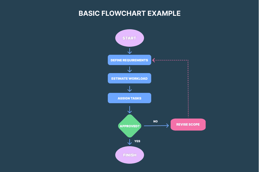
Process flow diagram: the basic flowchart
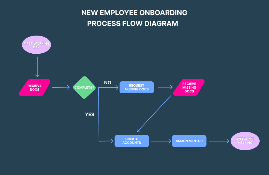
A process flowchart, aka a flow process chart, arranges different stages of a process in sequential order from beginning to end. It's the most common type of diagram you’ll encounter, and it's the one you'll reach for most often out of all process charts.
A process flowchart is good for mapping how users navigate through onboarding, checkout, or support flows. Overall, it's the go-to type for breaking down standard operating procedures and release processes, and any other situation where the main question is “what are the steps?”. It is used by mechanical engineers, software teams, and operations managers alike.
Any sequential process is far more informative as a simple flowchart, cause you spot gaps and missing steps that stay invisible in a text description. If your team has never built a basic flowchart before, start here: a process flowchart is the easiest to draw and the hardest to misread.
Swimlane flowcharts
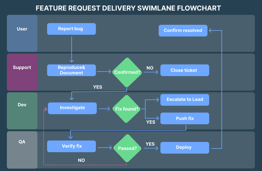
A swimlane flowchart is a process diagram divided into parallel lanes, with each lane representing a person, team, or department. It shows not just the steps, but who owns each one and where the handoffs happen. You might also hear it called a cross-functional flowchart. The magic of a swimlane diagram is that it answers “who does what” at a glance.
Swimlane flowcharts are good for processes where ownership matters, such as feature delivery, which usually involves multiple handoff points.
Most flowchart tools include a swimlane flowchart template you can adapt for your team structure.
By the way, Planyway (our planning and tracking app for Jira and Trello) uses swimlane diagram logic to show the timeline and assignees of a process: each team member gets their own lane on the timeline, and tasks flow across them. So if you’ve ever wished your swimlane flow chart were connected to actual dates and people, while also helping with workload management, that's essentially what Planyway does. It connects to your information system — Jira, Trello, or GitHub — and turns the flowchart into a live schedule.
IDF/Ishikawa flowcharts
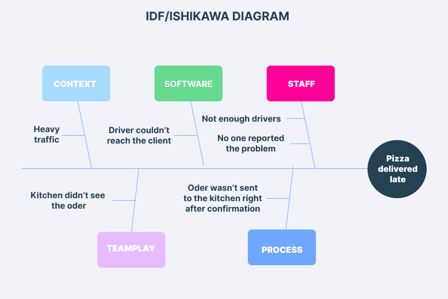
An Ishikawa (or a fishbone) diagram is a combination of a data flow diagram and cause-and-effect analysis. It maps the potential causes of a problem, grouped into categories. If you layer it with how data flows through your system, you'll get a picture of how data moves, what failed, where, and why.
An Ishikawa diagram is good for quality control, information processing, retrospectives, and "post-mortem" analysis of a flopped release. It helps the team structure all possible causes and look into what went wrong.
Workflow flowchart
A workflow diagram is a more detailed version of a process flowchart. It goes beyond the sequence of stages and shows who does what, in what order, with what tools, and what triggers the next step.
A workflow diagram is good for automating or optimizing the business process your team runs every day, mapping document flow (who reviews what and in which order).
Influence diagrams
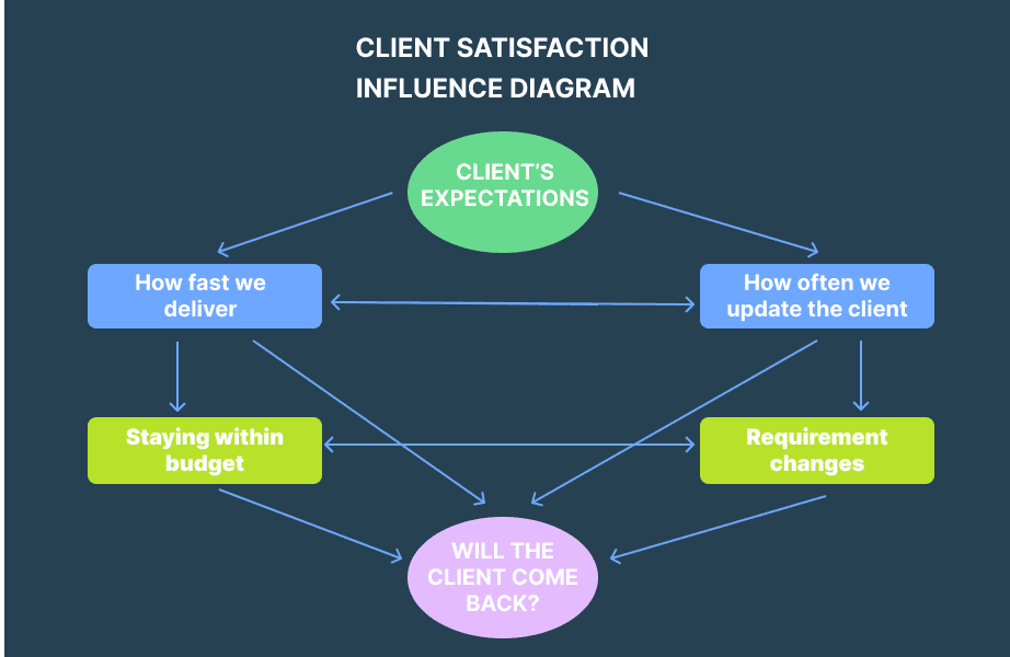
An influence diagram tells a visual story about how decisions, risks, and goals connect. Unlike the types above, it shows networks of dependencies rather than a step-by-step flow.
Influence diagrams are good for risk analysis and strategic decision-making. They show whether your plan is sustainable and highlight the "if-then" scenarios that come with it.
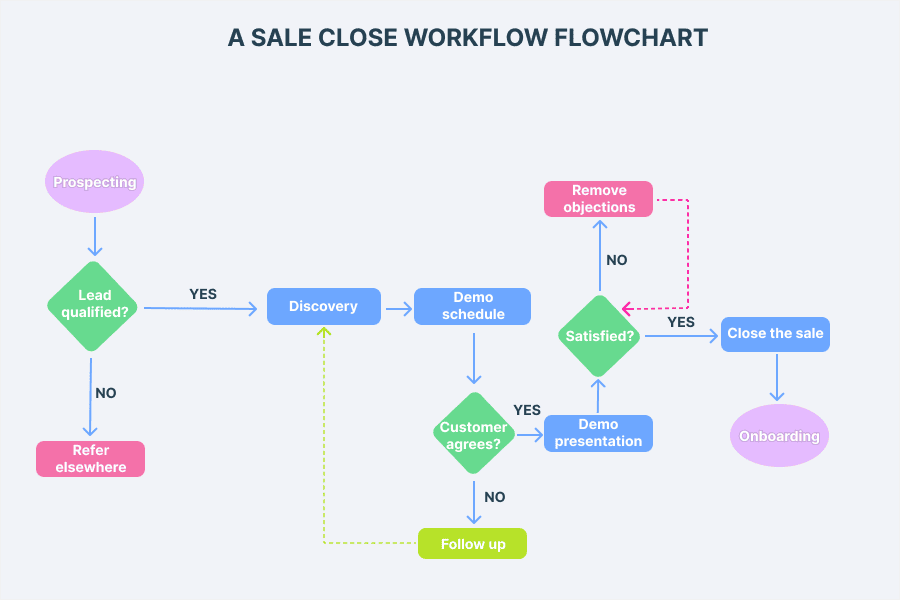
Decision maps
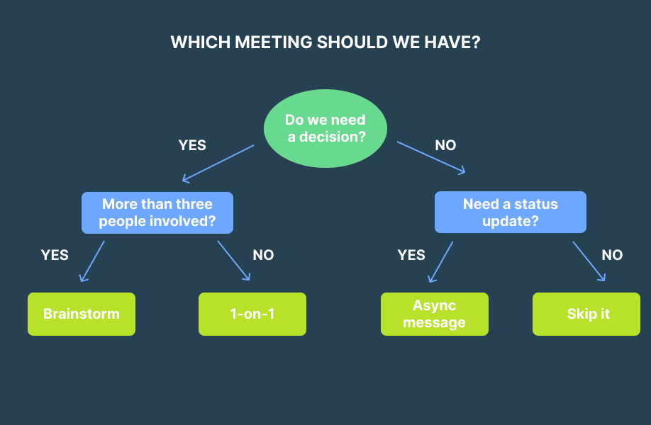
A decision tree starts with a single question and branches into yes/no paths, with each answer leading to the next question or one of several possible outcomes. The same branching logic powers most computer algorithms. If you're familiar with if/else statements in software engineering and computer programming, you already know how a decision tree works.
Decision map flowcharts are good for approval workflows and triage processes. They are useful for everything from “should we escalate this bug?” to “which hotel to book in Hawaii?”
📌 Pro tip: If your flowchart isn't working, the type might be wrong. Switch to a different one, or break it into layers.
There are also more specialized types, like a system flowchart, which maps how data moves through an information system, whether that's hardware, software, or databases.
How to make a flowchart: basic steps and not-so-basic tips
Basic steps:
- Pick clear start and end points. For example, ”Client submits request → Request fulfilled”. If you can't name the start and the end, you're not ready to draw.
- List all the steps in the right order. No need to add shapes yet, just get the logic and the sequence right.
- Draw the flow using standard symbols. Stick to the six from the reference card above. Consistency and simplicity beat creativity here.
- Review with the team. If people squint at the diagram, it's too complex and won’t work.
Here are bonus tips from our team that we've gleaned from actually building and using flowcharts on real projects:
📌Tip 1: Comparing 3 possible scenarios
There's a technique from Harrington Emerson called "process idealization": you draw the ideal version of your process (zero waste, zero workarounds)and then draw how it actually works today. The gaps between the two become your improvement backlog.
While you're at it, draw the failure paths too. A flowchart is most valuable when it makes edge cases visible before the project fails.
📌Tip 2: If your flowchart doesn’t fit on one screen, it’s probably two flowcharts or more
Scope creep applies to flow diagrams, too. Our brain processes complexity in layers, and your flowchart should do the same. Start with a general flowchart for the overview, then create a detailed flowchart for each phase.
📌Tip 3: Draft with sticky notes first
It’s often easier to make a rough draft with sticky notes on a board (Miro or physical), and then transfer to a clean version. This way, you can rearrange steps freely while focusing on the logic instead of getting stuck aligning boxes and arrows.
📌Tip 4: Design for the reader, not for yourself
Before you start drawing, ask yourself who's going to read it. Always consider the intended audience of your flowchart. A diagram for developers and a diagram for executives shouldn't look the same.
Planyway: where flowcharts turn into real plans
The diagram is a strategic tool, so it only does half the job. In practice, you often need to turn the process you mapped into a living plan your team can act on, like a timeline with real people, real dates, and real capacity. The flowchart says “QA reviews the build after dev is done.” The timeline says “QA reviews the build on Thursday, and Maria has 4 hours available for it.”
Planyway maps the outline to a working calendar in Jira, Trello, and GitHub. It shows all your work on a multi-project timeline, with a workload view that reveals each person's capacity, and drag-and-drop scheduling so you can instantly adjust the plan when reality doesn't match the flowchart.
Start with any flowchart maker to map the process, then bring it to life in Planyway for free.
FAQ
Three core components of a flowchart are shapes that represent steps, arrows that show the direction of the workflow, and labels that explain what happens at each step.
These are process flowcharts, aka process charts (linear step-by-step flows), swimlane diagrams (who does what across teams), workflow diagrams (detailed operational flows with triggers and tools), and decision trees (yes/no branching to an outcome like in computer programs).
You can use flowcharts for business processes, customer journey maps, product flowcharts, document flowcharts for tracking paperwork and approvals, data flows and system architecture, a data flowchart for tracking information between systems, presentations for stakeholders, system flowcharts for IT infrastructure, and many other scenarios.
Every flowchart maker has its strengths. Popular options include Lucidchart, Microsoft Visio, Textografo, FigJam, Mural, and Excalidraw as a free open-source option. For a quick sketch, even Google Docs or Google Slides can work. You should choose flowchart software based on your goal, team size, budget, and the amount of collaboration you need. Most tools come with a flowchart template library.