What is a progress report: essentials, tips, and templates

If you're reading this, you probably don't need to be convinced that progress reports matter. You also probably don't believe anyone who says that writing progress reports is fun. It takes real energy to come up with a structure that fits your case, carefully collect and organize data, and keep the needs of several target audience groups in mind at the same time.
We can't fix every reporting problem, but we can give you a comprehensive progress report guide that covers what a progress report actually is, which format and structure fit your project’s purpose, and how to choose a progress report template that holds up under real deadlines.
TL;DR
- A progress report tells whoever's paying for or responsible for a project whether it's on track, on budget, and what's changed since the last report.
- The right format depends on a combination of factors — who's reading, how often, how much detail they want, whether a decision rides on it, and whether they even have access to your project management tool.
- A good report structure boils down to three questions, answered in order: Where do we stand? What happened and what's in the way? What's next and what do you need from me?
What is a progress report?
A progress report is a written update on how a project is going, made for whoever is responsible for it or paying for it — a supervisor, a client, a sponsor, or the wider organization around the project team. Most projects don’t need a novel every week: a few paragraphs plus a clear status and next steps are enough.
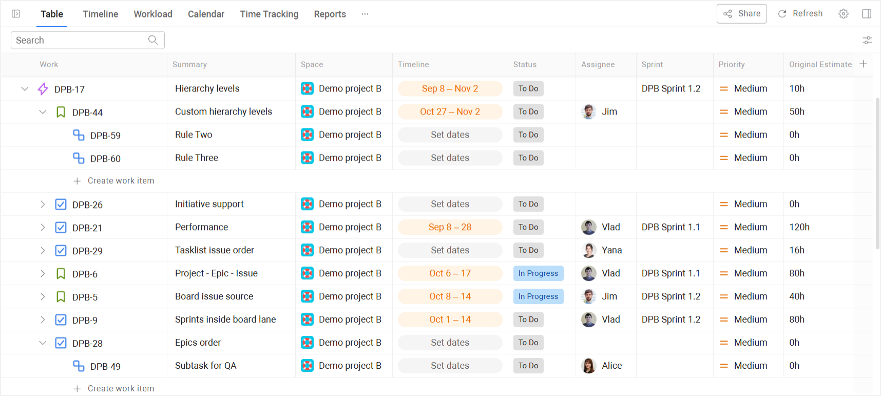
⬆️ A cross-project progress report in Planyway.
A well-written progress report answers a short, predictable set of questions for its reader:
- How much of the work is completed so far?
- What part is currently in progress?
- What work remains to be done?
- What's the expected date for the rest?
- What changes, challenges faced, or unexpected issues have come up?
In practice, that often means listing the specific tasks completed this period, the work that’s still in progress, and the pieces that haven’t started yet. It doesn't replace the full project plan or every piece of documentation around it, and it doesn't dig deep into the weeds, but it gives a genuinely complete picture of where the project stands right now. To make that clearer, let's put it side by side with the other documents a good project manager ends up needing along the way.
Progress report vs. other documents (a quick comparison)
| Document | What it covers | How often | Best for |
| Progress report | Movement since the last report: what moved, what's stuck, what changed in the project timelines or budget, and which major milestone was hit | Daily progress reports, a weekly report, or a monthly report, depending on the project | Keeping a sponsor, client, or supervisor current on something still in motion |
| Status update | A quicker, more informal snapshot for an internal audience | Daily or weekly | Fast syncs where the engineering team is already close to the work |
| Final / project report | The full outcome once the project ends — what shipped, what was learned | Once, at close | Documenting the record after everything's done |
| Meeting minutes | What was discussed and decided in one specific meeting | Per meeting | Capturing decisions, not ongoing project status |
| Risk report | Only actual and potential risks — impact, likelihood, and how you plan to respond | As risks emerge, or on a fixed cadence alongside the main report | Isolating risk from the rest of the update so it doesn't get buried in general status |
| Resource report | Workload across the team — who's over-allocated, who has room | Usually for the project manager's own use | Catching allocation problems before they turn into missed deadlines |
| Project variance report | Planned versus actual, broken down by whatever you're comparing — outcome, timeline, scope | Per reporting cycle | Making drift from the plan explicit and measurable, rather than a vague feeling |
| Project budget report | Planned versus actual spend | Per reporting cycle | Tracking whether the project is still financially on track, independent of schedule status |
Four benefits of regular progress reporting
The core function of a progress report is persuasive. By regularly showing what has been achieved, it reassures the people who matter that the project is on track, or it gives them an honest, early reason if it isn't. Beyond that, sticking to regular intervals of reporting buys you a few extra benefits:
- It lets stakeholders see both work completed and work in progress, not just the final deliverable — that brief window into preliminary findings and in-flight project management tasks takes the pressure down, reduces the risk of unpleasant surprises at the end of the project, and helps you assess larger goals as part of ongoing future planning.
- It creates space for real course correction — clients and project managers adjust the project plan as context and priorities change.
- It surfaces problems while they're still small and creates a forward audit trail — if something goes wrong, you already have a timeline of data to retrace the course of the project, discuss problems openly with stakeholders, and figure out what to fix.
- It forces you to keep a real schedule — knowing you have to report on progress on a fixed cadence is a strong, quiet incentive to actually establish and stick to a work schedule in the first place and to plan next steps.
How to choose the right format for a progress report?
There’s no single “right” progress report format — the best choice depends on who’s reading it, how often they get updates, how much detail they actually want, and whether any decisions or approvals depend on that report.
Before you settle on a format, ask yourself a few questions:
- How often does this go out? A daily progress report and a one‑off milestone review for a stakeholder can’t be in the same format: one needs to be read in ten seconds; the other deserves a proper, detailed write‑up.
- Does the reader want the details or just the verdict? Your team and your sponsor don’t even want the same kind of information, so they shouldn’t get the same kind of report.
- Is a decision or sign-off riding on this? A report that triggers a budget approval or a scope change needs to exist as a document people can point back to, and it has to rest on clear data and project status facts, not on assumptions or wishful thinking.
- Do you need a record six months from now? Long-running programs and client contracts often need a paper trail. A live dashboard has no memory of what it looked like last quarter unless you're deliberately snapshotting it.
- Can everyone in your audience actually open what you're about to send? Teams build a thorough live dashboard, feel good about it, and then discover that a stakeholder can’t even view it, simply because they were never meant to be a project management tool user in the first place.
The four common progress report formats
With all of that in mind, here’s how the four common formats actually differ:
Status update
A status update is a short written update in a tool, email, or chat, sent daily or weekly. It fits high-frequency, low-formality, internal audiences who want a fast pulse check, and it doesn’t really hold up for anyone outside the team or for anything that needs a decision attached.
Progress report document
A progress report document is a structured write‑up covering milestones, risks, and timeline changes. Most of the time it’s the default option for communicating with clients, sponsors, and cross‑functional stakeholders. Its main constraint is that it’s static by design: it’s meant to be sent and archived, not logged into.
Dashboard or visual report
Dashboards are live, always‑updating views built on your project data. They work best for a self‑serve, detail‑hungry, high‑frequency audience that uses the tool every day, especially when they prefer visual aids over long written summaries. However, keep in mind that this report format is not the best option for when your audience needs a clear verdict, needs a historical snapshot, or simply can’t get in.
Presentation
A presentation is a verbal or slide‑based format used when you need to explain complex concepts, report on work completed, and offer a few options for the client or stakeholders to evaluate. It’s a high‑level, decision‑oriented cut of the progress report, designed for a room, a conversation, and a choice.
To pick the right format, take a hard look at your audience, cadence, and the tasks this report has to support. Don’t rush to whatever’s fastest to put together — saving an hour now can cost much more later, if the wrong format means people don’t read it, don’t understand it, or can’t use it to make decisions.
| Format | Typical frequency | Audience | Decision-ready? | Tool access needed? |
| Status update | Daily or weekly | Internal team members | No | No (email/chat is enough) |
| Progress report document | Weekly, monthly, per phase | Clients, sponsors, stakeholders | Yes | No (meant to be shared) |
| Dashboard / visual report | Real-time, on demand | Detail‑hungry tool users | Not by itself | Yes (access to the tool) |
| Presentation | Milestones, key reviews | Leadership, decision makers | Yes | No (slides in a room) |
Key sections of a good progress report
As we’ve already established, the structure of a progress report is never one-size-fits-all. But if we break it down into the most common building blocks that show up in real reports, they look roughly like this:
1. Where do we stand?
This is the only part most readers will actually read, so make sure to put it to the fore. It also needs to be as clear and concise as possible: say whether the project is on track, at risk, or behind. And anywhere you’re not “on track", you owe the reader an equally clear, honest one-line explanation of why.
If you're including a % completion figure, be explicit about the measure.
- Counting tasks completed tells you how many tickets are finished but says nothing about their size.
- Using story points shows how much of the estimated effort has been delivered, which works only if the team estimates consistently.
- Comparing time logged vs estimated helps answer whether you’re spending time the way you planned but depends heavily on people logging their hours accurately.
- A manual numeric target (like “grow signups to 20,000”) tracks progress toward a business outcome but only moves when someone updates it by hand.
2. What happened, and what's in the way?
This is the substance of the report. Cover three things here: what was planned for the period, what actually got done, and what remains in progress. Use real numbers wherever you can, especially for completed work, missed targets, or shifts in timeline — specifics build trust and are easier to scan. Name the concrete wins worth highlighting, take a moment to celebrate wins that actually mattered to your stakeholders, then state any blockers plainly, together with what you’re doing about them and whether anything is needed to unblock the work.
3. What's next, and what do you need from me?
Close with the forward view: what’s planned for the next period, by when and who owns it. A good ending should make the next step obvious. If you need a decision, approval or feedback, say so directly.
Templates and examples of a progress report
Templates and examples of a progress report are less about style and more about giving you repeatable, low‑friction ways to say the same core things every time. When you’re writing progress reports regularly, a lightweight progress report template keeps that structure stable from one report to the next. Each format below is just a different way of arranging the same three pillars — a clear verdict, the substance behind it, and a concrete ask — so you can pick the version that fits your project, your target audience, and how fast your work is moving.
Template 1: Simple bulleted list (For fast-moving teams)
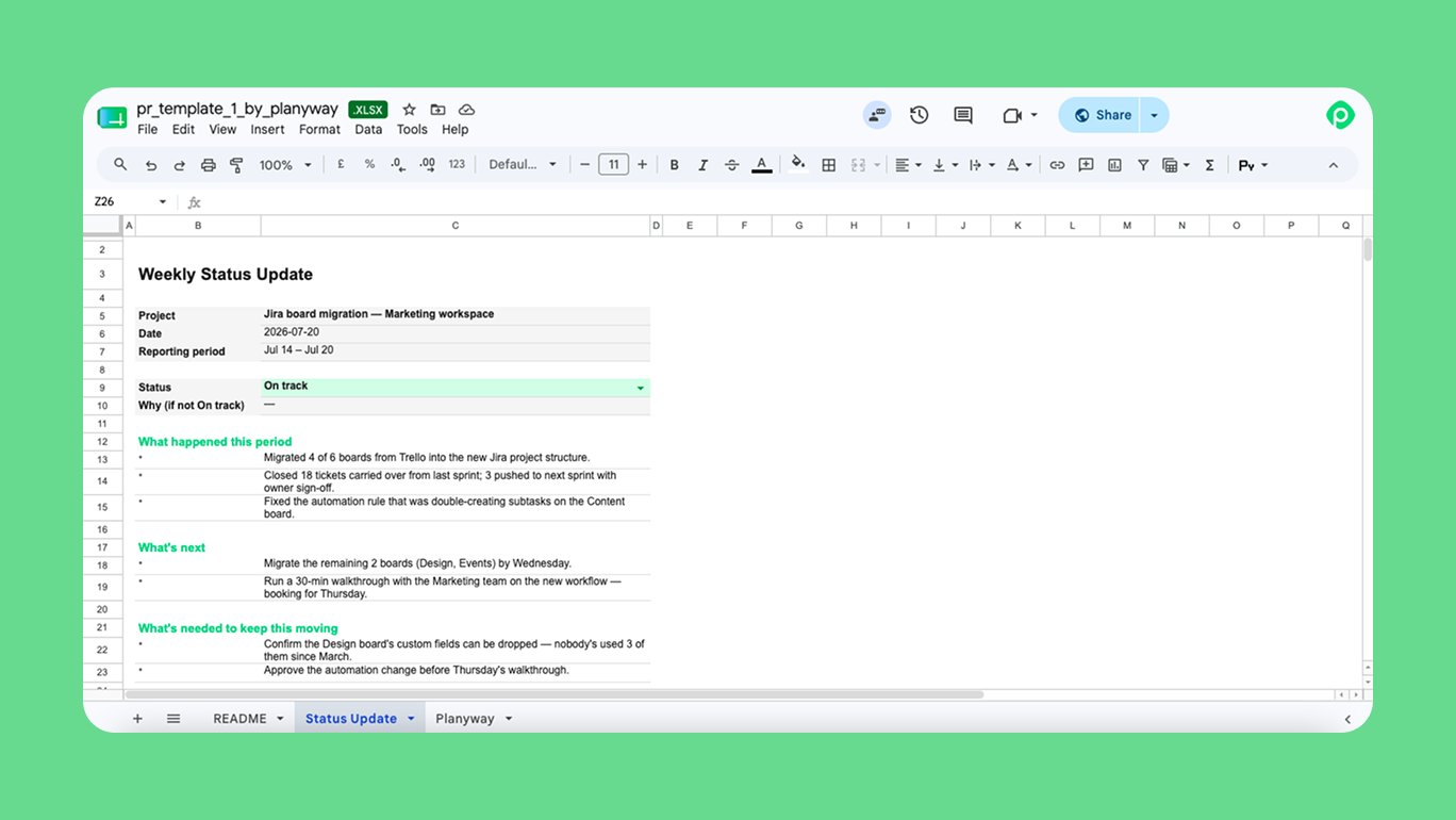
A simple bulleted list is the lightest version of a progress report designed for fast‑moving status meetings and daily progress reports. At bare minimum, it includes one line with the project name and date, one clear status line (on track, at risk, or behind, with a short “why” if it’s not green), a few bullets on what happened this period, and a short list of what’s next and what you need from the reader.
It’s a compressed version of the three‑part full report structure (verdict → substance → ask). If your specific case calls for an extra detail or two, add them freely; just remember that the strength of this format is its brevity and focus
⇒ Get the simple bulleted progress report template
Template 2: Table format
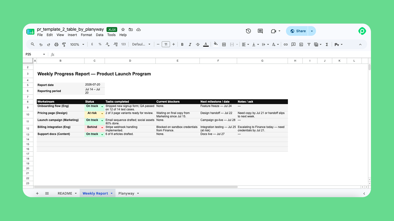
The table format is a good fit when one progress report has to cover several workstreams at once. It’s still the same three‑part idea, just laid out so you can compare parts of the project side by side: verdict in a status column, substance in the rows of details and data, and an “ask” section underneath for decisions and feedback.
You get a clear grid of project management tasks, tasks completed, current project status, blockers, and the expected date for the next step in each area. This works especially well for a weekly report or monthly report cycle where you need a detailed progress report that can still be scanned in about 30 seconds.
⇒ Get the table‑based progress report template
Template 3: Dashboard-style spreadsheet
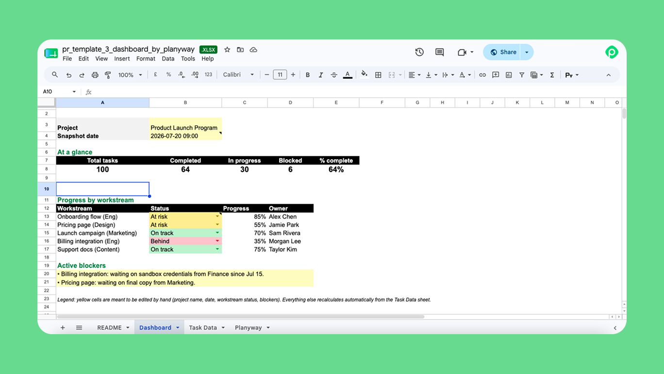
The dashboard format is a great choice when you want to show project progress visually instead of writing a detailed update. It brings together project status, timelines, milestones, Gantt charts, and key metrics into a single view, making it easy to see how things are going at a glance.
It's especially useful for executives and stakeholders who need a quick overview rather than a deep dive into the details. While a dashboard makes it easy to spot progress, risks, and upcoming milestones, it's often paired with a short written summary to explain what changed, why it matters, and what comes next.
⇒ Get a dashboard progress report template
How to create progress reports based on live Jira data with Planyway?
The templates above work well when you're creating reports manually. But if your projects already live in Jira, there's an easier way to keep everyone updated without copying data into spreadsheets every week.
As a cross‑project and cross‑team planning layer inside Jira, Planyway turns Jira project progress data into a live view of project timelines, workload, and time tracking data in one place, updating in real time as people move tasks, log time, or shift deadlines.
You can customize each view depending on who needs the update — from a high-level stakeholder summary to a detailed delivery plan for your team.
For example:
- Timeline grouped by epics shows progress across major initiatives and milestones.
- Timeline grouped by users highlights workload and ownership.
- Timeline grouped by components helps track progress across product areas.
- Portfolio views bring multiple Jira spaces together for cross-project reporting.
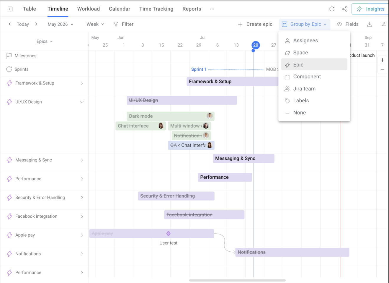
For a more structured breakdown, Table view shows Jira work items in a hierarchy — from epics to tasks and subtasks — instead of a flat issue list. It helps teams review project scope, track progress, and create detailed updates across multiple Jira spaces.
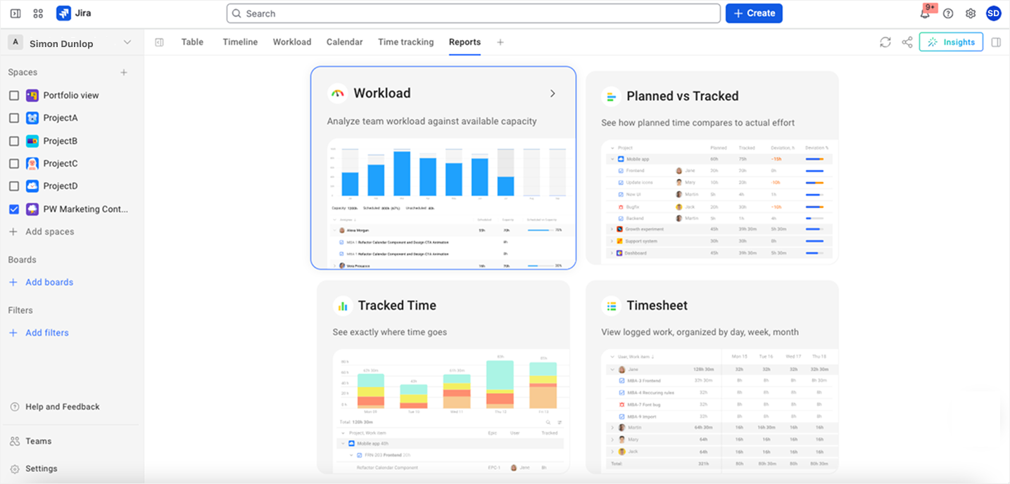
For deeper analysis, Planyway also provides reports that focus on the numbers behind progress — such as tracked time, planned vs. tracked work, and workload. You can export this detailed progress report view to Excel, PDF, or CSV (or just share it via link) with all your current filters and sorting preserved — and then build the narrative layer on top, in whatever report format your target audience needs.
P.S. Planyway also supports teams working in Trello by adding a unified timeline and workload layer on top of boards, so you can see how projects overlap and what’s happening across teams in real time.
How often should you report?
Weekly reports tend to be the default for most projects, but the real frequency depends on project length, stakeholder expectations, and team pace. Some teams rely on daily tasks and daily updates and avoid creating huge detailed reports. Others work in weekly or monthly cycles, and long‑running programs add quarterly reports for leadership and the wider organization.
Either way, a clear cadence helps everyone know what to expect from the next report: when it will arrive and what kinds of decisions it’s meant to support.
Can AI actually write your progress report for you?
You’ve probably already seen some version of the advice to “just point an AI agent at your Jira project, ask for a status report, and walk away.” We hope it will work that way soon, but real‑world experience suggests it’s not there yet: an AI agent tasked with assembling a full, multi‑level Jira status report across many issues often comes back incomplete, because it can’t reliably fetch and cross‑reference everything in one pass.
The rough lesson is that agents are strong at turning existing data into readable summaries but still unreliable as the primary engine for complex data gathering across large hierarchies. If you want a deeper dive into how Jira’s own AI stack — including Atlassian Intelligence and Rovo — actually behaves in practice, we broke that down in a separate article.
The practical workaround is simple: let deterministic automation handle data collection on a schedule, then use AI to summarize what’s already been gathered into a narrative progress report.
Planyway tips for writing insanely good progress reports
Here are some of our best practices that have survived contact with actual clients and actual leadership.
Use a consistent status color scheme
A consistent color code helps everyone read the progress report at a glance. In a simple RAG scheme, green means on plan, amber means “There’s a concern,” and red means “I need help”. Some teams extend this to BRAGG — adding blue for complete and grey for paused or on hold.
Keep visuals simple and scannable
Charts with Gantt‑level detail don’t belong in a progress report — they’re simply too dense to read quickly. If you need information from a Gantt chart, pull out the essentials and present them in a format that can be scanned in two seconds, like a quarter‑level roadmap grid with colored status blocks or a single status line with a clear, one‑sentence explanation.
Summarize progress with key metrics
In a progress report, progress is usually collapsed into one clear number instead of a full task list. A single percentage or a completed/total fraction (“62% complete”, “12 of 18 milestones hit”) stands in for the detailed breakdown, which moves into backup material or dashboards that people only open if they need to drill down.
Keep the format consistent
Once you’ve picked a format and a structure, don't change either without a reason. Consistency is what lets a reader trust the report enough to skim it — which, for most reports, is the whole goal. Use extra resources for detail, and keep the main report lean.
What are the most typical progress report mistakes?
Almost every complaint about bad progress reports can be traced back to just two root causes: the report either avoids the truth or the point. Everything else is a symptom of one of these two.
Avoiding the truth shows up as the following:
- Green statuses holding steady right up until the week everything turns red. Bad news that arrives with no warning is exactly how you lose leadership’s trust.
- Reporting activity instead of outcomes. Activity is easy to log and feels safe to report, but it’s almost always useless to the reader and quickly becomes a source of irritation.
- Vague hedging that sounds like an update but commits to nothing checkable. Swap “made significant progress on testing” for “passed 85 of 90 integration tests” and the hedge disappears instantly
Avoiding the point shows up as the following:
- Burying the verdict on slide four. If your first line doesn’t clearly say on track, at risk, or behind, you’re not really reporting yet.
- No clear statement of how much planned work was actually completed. That forces the reader to reconstruct the real story from the details.
- No short forward view. Every report should cover three simple dimensions: what happened, where things stand now, and what this is likely to mean next.
- An inconsistent format from one report to the next. If readers have to relearn how to read your update every time, the format is getting in the way.
Make every progress report worth reading
In the end, a good progress report is all about giving your project team and stakeholders a clear, honest view of project status, completed tasks, and the next stage of the work. It turns scattered updates into a shared baseline for expectations, improvement, and future planning and makes each report easy to read, easy to trust, and easy to act on.
If you want your next progress report to be based on live project timelines, real workload data, and fewer manual exports, let Planyway do the heavy lifting.


FAQ
A progress report is a regularly created document that summarizes project status over a period: how much work is completed, what's in progress, what's left, and what's changed.
Progress reports are important because they keep supervisors and stakeholders informed about project status, help them adjust the project plan, and support better decisions about time, budget, and future work.
To write a comprehensive progress report, start with an executive summary (verdict), then add substance, and finish with an "ask". Choose a progress report template that fits your target audience and cadence.
There are 4 common types of reports: status update, progress report document, dashboard or visual report, and presentation.
In the progress report you don't reveal the entire working process; only outcomes and reflection are important.
The main purpose of a progress report is to give stakeholders a clear, realistic picture of project status so they can set the right expectations and make informed decisions about next steps.
To create a progress report, you can use anything from a plain document or email to a live dashboard built on your project management tool. Teams working in Jira or Trello often layer a tool like Planyway on top.