Executive reporting: how to create better reports (+ free example)

Almost every manager writes reports. Almost every manager also suspects nobody reads them — and quite often that suspicion is correct. A report that gets skimmed once and archived is a few hours a week spent producing a document that changes nothing.
That's a waste, because reporting is one of the very few things a manager does that cuts across the whole company at once: upwards to the board, sideways across departments. Done well, it's the cheapest way there is to point leadership's attention exactly where it's needed — or, just as usefully, to confirm that they don't need to look at your project at all this month.
This article is about executive reports specifically. What makes them different from the regular status report, what an exec is actually looking for when they open one, how to judge whether yours is any good, and the mistakes that show up most often. At the end there's a working template, free to take and adapt to your own context.
TL;DR
- An executive report is a concise overview designed to answer one key question: does this project require leadership's involvement or reaction?
- A good report communicates clear and actionable insights (or key metrics) quickly, while providing enough detail for senior executives to gain a deeper understanding and investigate further when necessary.
- The best executive reports are built around their audience, decisions, and priorities — and stay consistent, accurate, and honest over time.
What’s an executive report?
An executive report is a structured document designed to inform its target audience on the state of a subject or a process with a purpose to support understanding or a decision.
And this definition contains a few key things that are crucial but may sometimes be overlooked by many managers. These are:
- Subject
- Target audience (or consumers)
- Structure
- Information
- Goal
The difference between a regular status report and an executive report lies in how each of these elements is approached.
An executive report vs. a regular report
So if we take a regular report, the components we’ve mentioned above will work in the following way:
- The subject is still the project that you are managing.
- The target audience can be any stakeholder with a different focus.
- The structure is more generic, with a focus on an abundance of detail rather than a narrow focus.
- The information covers full operational detail - tasks, blockers, day-to-day progress.
- The goal is simply to inform the audience (and possibly prevent any nosy questions).
Conversely, in an executive report:
- The subject is the project that you are managing (or a specifically mentioned part of the project).
- The target audience is an executive or all board members.
- The structure is specific to the needs of the leadership team.
- The information is specific to the key performance indicators defined as important by the higher management.
- The goal is where things get interesting. Any executive looking at a report is ultimately looking for an answer to one question: Does this project require my involvement or reaction? If the answer is yes, other questions may follow. If the answer is no — well done. You've just saved your boss a ton of time!
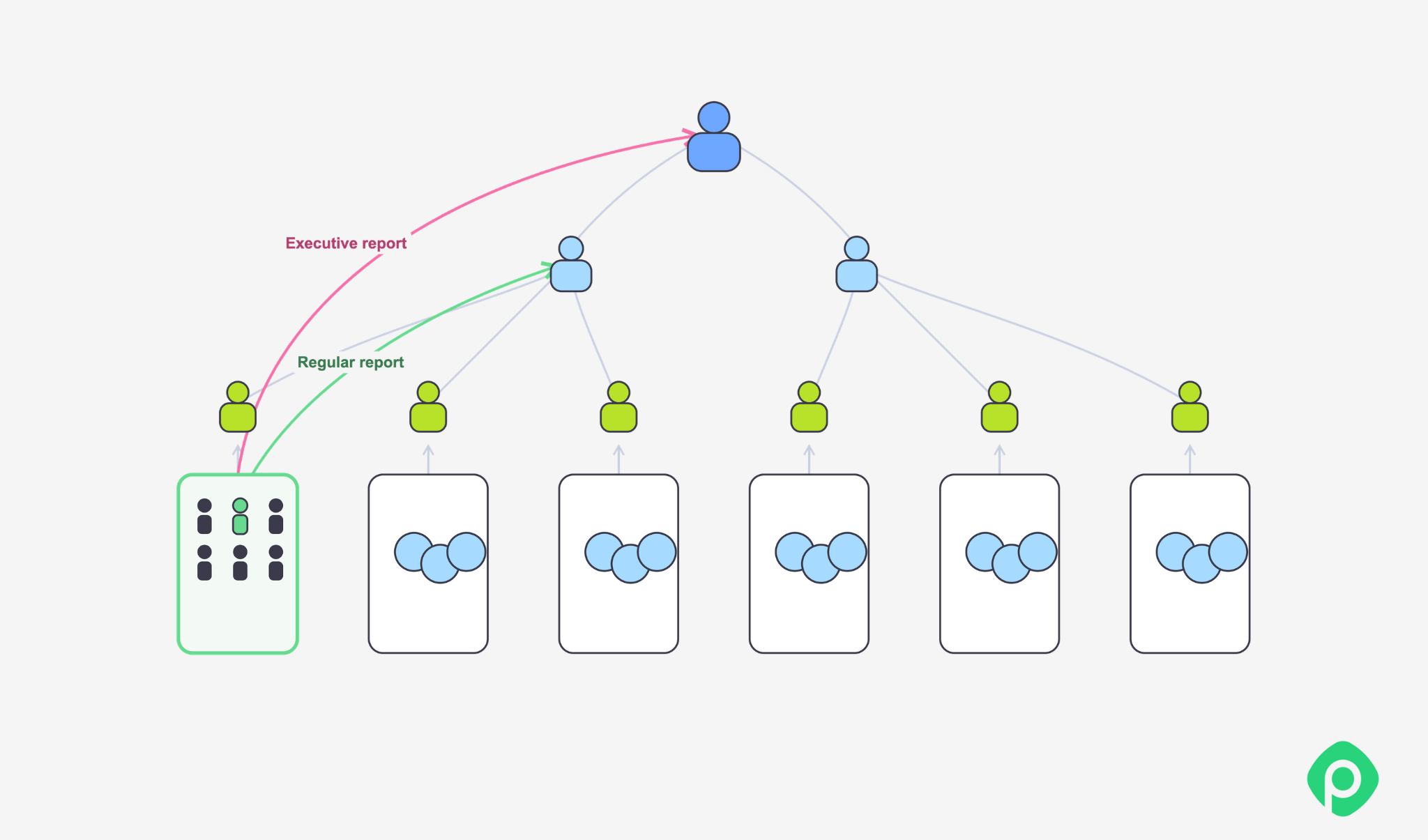
However, the purpose of an executive report extends beyond simply saving leadership time. Regular, high-quality reporting can also bring broader benefits to both managers and the organization as a whole.
Reporting is underrated (or the fundamental benefits of executive reporting)
Whenever reporting comes up, the process itself — and the reports it produces — is often underestimated. Reporting can be tremendously valuable, yet it is frequently misused or treated as a box-ticking exercise. In the worst cases, it becomes a complete waste of employees' time as they gather and prepare complex data that no one actually needs. But when done right, it proves to be one of the most valuable tools at a manager's disposal.
An executive report is a means of communication
A report is one of the few communication tools that can move information across both vertical and horizontal layers of an organization — from teams and managers to leadership, and across departments and functions.
That makes reporting far more than a way to communicate project status. It helps ensure that the right information reaches the right people, in a form they can understand, when they need it to make a decision or take action.
It is a tool to understand what’s going on in the company
More specifically, executive reporting gives leadership a regular, brief overview of the company's current state. And building that view is no simple task: executives need to keep track of multiple projects, teams, departments, and other aspects of running the business at the same time.
An executive report works somewhat like an X-ray. You select a specific area to examine and get a clear picture of what is happening there — but you cannot see everything at once. This makes it critical to choose relevant data and structure it in a way that shows executives what they actually need to see.
At the same time, reporting gives managers a structured way to bring key takeaways to leadership. Even within a carefully defined format, a good report should leave enough room to raise issues that may not appear in standard metrics but could otherwise escape an executive's attention.
It’s a tool to tell everyone in the company what’s actually important
As a rule, an executive report and its structure are never arbitrary and are determined by senior management — to reflect what the organization considers most important at a given time. The structure itself communicates those priorities. Key insights typically appear at the top of the report, with supporting details and context following later.
The metrics inside the report reinforce the priorities, especially if the leadership defines the specific metrics used to judge whether things are moving in the right direction. This gives managers and teams a clearer understanding of what success looks like, where their attention should be focused, and whether the company is on the right track overall.
It’s a tool to keep everyone on the same page and on equal terms
If the report is standardized for projects in different departments, it means that the same metrics apply to everyone and success is measured well.
Unlike a manager reviewing a single team, an executive is rarely looking at just one project - they're weighing it against everything else competing for the company's time, budget, and attention. A standardized executive report gives them a fair basis for that comparison: if every project reports against the same metrics, leadership can quickly compare key findings and see which ones are healthy, which need intervention, and which deserve more resources - without relying on gut feeling or who presents best in a meeting.
This is also why "Does this project need my involvement?" is rarely the full question. The real question is closer to: “Does this project need my involvement more than something else on my plate right now?” A good executive report doesn't just describe your project in isolation - it gives leadership what they need to weigh it against every other claim on their attention.
It’s a tool to help you structure your operations
The composition of the report should give you an idea of how to structure your project planning process and day-to-day work as well: which meetings are more important, which have higher stakes, which tickets should be dropped from the backlog and forgotten, and which should have an increased priority.
The metrics requested in a report can also influence the processes used to manage work. Do the metrics require story point estimation? Lead Time measurement? SPI or CPI tracking? This might be a determining factor in how you manage your projects and set expectations for the team members.
So, as you can see, a well-established reporting practice can bring a lot of benefits — not simply by showing the state of the company, but also by improving the day-to-day activities.
How to tell whether the report is good?
The most important principle behind any good report is simple: it is a means of communication designed to serve a particular purpose.
That means a report should be judged by the same principles as any other form of effective communication. At a basic level, successful communication depends on finding the right balance between three things:
- the amount of information being communicated;
- the accessibility of that information;
- the value of that information...
...per unit of time.
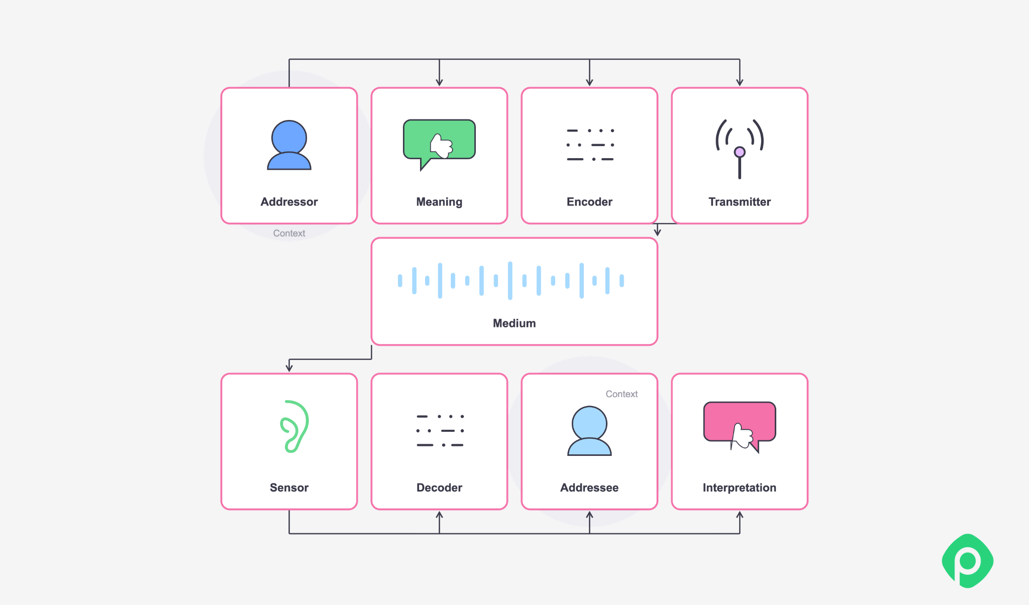
In the image above, you can see the way any communication happens in sequence. Think about how reporting works at every stage of this sequence.
The goal for any piece of communication is for the initial meaning and eventual interpretation by the target to match semantically. The goal for any message is to provoke an expected reaction from the target(s). Therefore, the goal of executive reporting is not simply to transfer information. A message should be understood as intended and, where appropriate, provoke the expected reaction from its audience.
For executive reporting, this principle should guide every decision about what goes into the report and how it is presented. The audience, the purpose, the structure, and the information itself all need to work together.
Audience
Your target audience and its goals and interests will lay the ground for your report. A good executive report draws upon the most important things as regarded by the C-level. The execs will typically define upfront which metrics matter, what should be important, and what “health” vs “at risk” should look like. The more detail provided by the person requesting the report, the better aligned the final report is likely to be with their expectations.
Goal
A good report always takes into account the purpose it is meant to serve and the decisions that will be made based on it. Ideally, the purpose and expected decisions should also be outlined by the execs, which would make the manager’s job much easier.
Structure
As the rule of successful communication mentioned above suggests, a good report should maximize the value and the amount of presented information, right up until this compromises accessibility. So a good report structure is both short and long exactly for this reason:
- it’s short, because the main message should be concise and clear;
- it’s long, because it should have an easy way to dive deeper into the numbers.
Yes, this might also mean that 90% of the time spent preparing detailed information goes unused most of the time. However, not cutting it deep enough can be just as problematic and may leave the impression that the report lacks substance.
The most important things should be at the top, concise, precise, and clearly indicated. Further down the report, you can provide more detail and context for the points mentioned at the very top. The sequence of sections will usually look something like this:
- Overall status/health summary (including RAG indicators or similar);
- Progress against milestones/timeline;
- Budget/resource status;
- Key risks and blockers;
- Decisions or asks needed from leadership;
- Notable changes since last report (scope, timeline, team).
Information
Here we have to take care of the 2 main aspects: information quality and design. Quality is paramount, and it comes down to a few things:
- Accuracy over precision. A rough number delivered on time is more useful than a precise one that's stale. Don't imply more rigor than your data actually has.
- Freshness is essential. State when the data is as of. Pulling straight from your project tool beats a manually updated spreadsheet that can drift from reality.
- Consistent definitions are a must. "On track" or "at risk" must mean the same thing every time — within one report and across reporting periods — or the signal stops meaning anything.
- Traceability is extremely useful and convenient. An exec should be able to trust the data. Ideally, all numbers should be traceable back to the source system, not someone's memory.
- No spin allowed; facts are solid. Bad news reported plainly builds more trust over time than bad news softened until it's unreadable as bad news. And the same applies to every other fact in the report: it should be grounded in reality, not shaped to create a more favorable impression.
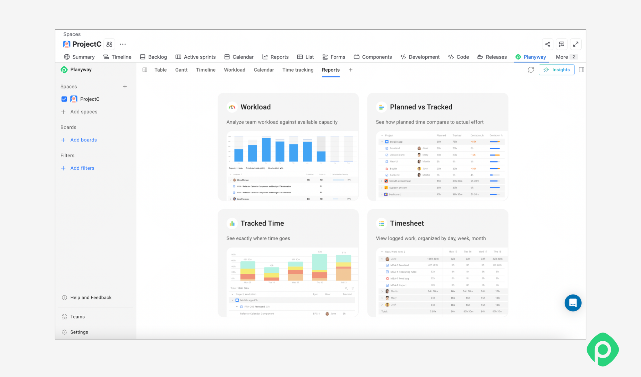
By the way, if you’re working in Jira and juggling a dozen spreadsheets and tools just to keep your reporting data up to date, Planyway for Jira can help bring much of that information together. It’s an all-in-one app that combines cross-project planning, resource management, and time tracking, making it easier to monitor progress, timelines, dependencies, and team capacity. You can also export ready-made reports based on your Jira data, without having to manually collect and organize the information first.
Best practices for designing an engaging executive summary
When it comes to design, there are many tips to make your report look better.
#1 Use RAG (red/amber/green) status indicators
The basic idea is intuitive: green means “good”, amber means “requires attention”, red means “something bad is happening”. However, the definition of “good” and “bad” should be clearly defined rather than left open to interpretation.
#2 Consistent placement, structure and design language
Usually, execs rely on muscle memory when reading those reports, so all the main building blocks should stay in the same place. Definitions and visual conventions should remain consistent as well: if “green” means good in one report, it should not suddenly mean something else in the next.
Along the same lines, pay attention to the small details, as they can have a significant impact on readability:
- background colour is white, standard writing colour is black;
- font is consistent, with bold or italics used only to highlight important parts;
- any changes to the report structure/legend are clearly stated at the beginning.
#3 Clean is better than flashy
The rule of thumb here is to avoid decorative visuals. And if you really need to bring something to the fore, use subtle means instead of bright colours.
The same principle applies to information density. Don't try to squeeze everything onto a single page at the expense of readability. Clear spacing and easy navigation are more valuable than fitting as much information as possible into the smallest possible space.
#4 Language and culture
The report’s language, tone, and level of directness should take into account both the organizational culture and the people who will be reading it.
For example, the word “fail” may be perfectly acceptable in one organization and inappropriate in another. In a culture where people are encouraged to acknowledge mistakes and discuss problems openly, saying that an initiative has failed may simply be an honest description of the situation. In a different environment, the same word may be interpreted as a catastrophe — or even as a threat to someone's reputation.
Neither approach is right or wrong — it just comes down to how your organization communicates and how your audience interprets certain language.
What if there are no clear reporting standards or report creation process?
Despite all of the principles discussed above, many organizations offer little guidance on executive reporting. Existing templates may be outdated, inconsistent, or simply no longer fit the way the organization operates.
In that case, use your best judgment. Also, you can propose a lightweight reporting template and ask leadership for feedback or sign-off before making it a regular practice. When creating such a template, take the following aspects into account:
- What decisions need to be made based on the report?
- How does the target audience prefer to consume information, and how much time will they spend reading the report?
- What can you reliably measure in your current setup?
- What data (and in what format) will reflect the current priorities of the organizations more fully?
- How do other managers handle the reporting? Check whether an informal reporting pattern already exists and consider following it. Trying to stand out may confuse an executive rather than impress them. If projects across the portfolio are comparable, consistency is an additional advantage.
- What is the current stage of the project? A report at the beginning of a project serves a different purpose and should contain different information than one produced halfway through delivery.
Executive reporting example
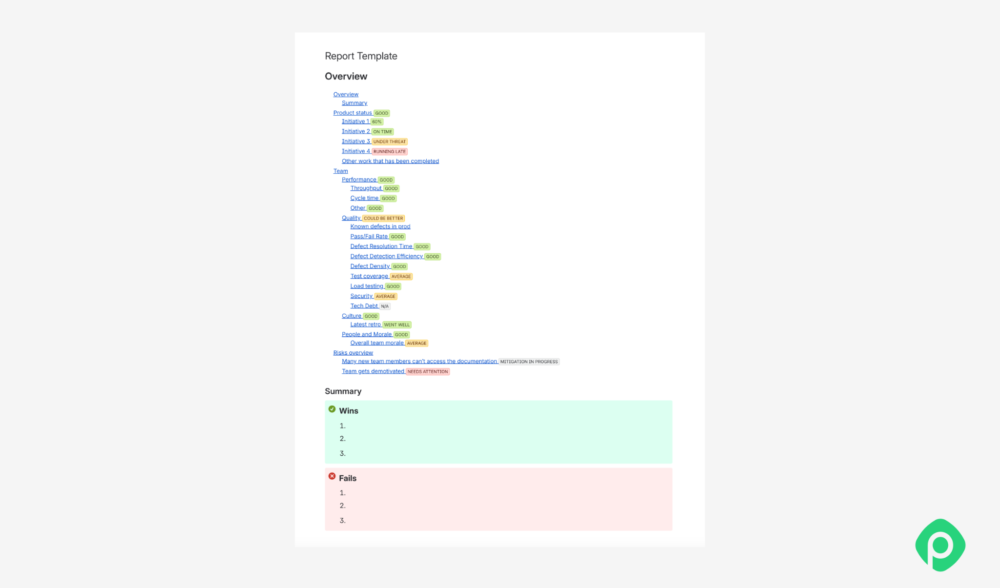
This generic report template provided by the author of this article can serve as a starting point and be adapted to the specific project and reporting requirements. While it was originally built in Confluence, the same principles apply regardless of the tool used to create and maintain the report.
Some sections, such as budget, may be missing. This reflects the particular environment in which the template was developed, where that information was not required as part of regular reporting. Depending on the organization and project, other sections may need to be added or removed.
Looking through the template, you'll notice that:
- A comprehensive summary appears at the top, with links that allow readers to drill down into the underlying data;
- The most important information comes first, with less critical details appearing further down;
- Risks are clearly highlighted using a version of PMI-style risk management;
- The design is clean and easy to navigate.
Download a free executive report example →
Common mistakes to avoid in executive reporting
Conflating project status with product success
A project status report and a product performance report (ROI, adoption, revenue) answer different questions for different owners. Mixing the two can obscure the one question an executive report should answer clearly: Does this require my involvement right now?
Marking everything as “good”
If every metric in a section reads green, the section stops carrying information - it reads as filler rather than signal. Only show sub-metrics that vary, or reduce the section to one line when nothing there needs attention.
Completely redesigning the report every cycle
The value of a report compounds with repetition: same format, same metric definitions, and issue after issue. Iterating on it each time breaks the muscle memory you're trying to build in your reader. Nevertheless, minor adjustments to improve readability and actionable insight are welcome.
Including details that don’t move the needle
Before adding anything to a report, apply a simple test: Will this change what the executive does next? If the answer is no, it probably belongs in the drill-down rather than at the top of the report.
Not asking what was left out
It's easy to build a report from what naturally comes to mind, such as this week's wins or the metrics on hand, without deliberately searching for what's missing. Before sending, make sure to ask yourself: Is there anything I'm not including because it's inconvenient, not because it fails the "Does this matter" test? The absence of a risk is a choice too, and it should be a deliberate one.
No report is perfect; yours isn’t either
Everything in this article - the frameworks, the design tips, even my own template - is guidance, not law. There's no universally correct executive report, because there's no universal executive, project, or organisation. What matters to your C-suite executives, what your tools can reliably measure, what your team's culture can hear without flinching - none of that is standard, so your report shouldn't be either.
The only real mistake is treating your first version as final. Send it, observe what executives actually react to and what they skim past, then adjust accordingly. A good executive report is not designed once and left unchanged — it is calibrated over time, one reporting cycle at a time. Here, as in many other management areas, it often comes down to being able to adapt on the fly and elevating where it makes sense.


FAQ
An executive report is a structured document designed to inform its target audience about the state of a subject, business, or process. Executive reports serve as a concise summary of the most important information, providing the context leaders need to make informed decisions and support data-driven decision-making. By organizing data and turning complex information into a clear overview, a report can give leadership valuable insights into a business's performance without forcing them to review every operational detail.
An executive report in project management is a status report built specifically for executives or a board. It provides a high-level view of a project's health, progress against the project plan, budget, resource allocation, and risks — filtered to what leadership needs to judge whether the project requires their involvement, rather than presenting the full operational detail a team-level report would carry.
A strong executive report should include overall status, progress against milestones and strategic goals, budget and resource status, key risks, emerging trends, external factors, decisions needed from leadership, and notable changes since the last report. Depending on the organization's objectives, it may also cover actual performance, revenue growth, and opportunities or risks that could affect the business plan.
The report should lead with a concise summary short enough to read in under a minute, with supporting detail available underneath for anyone who wants to dig deeper.
An executive reporting process is unique to every organization, but the key steps have much in common. Start with what the audience actually needs — ask them rather than assume. Use fresh data from reliable sources and your existing data stack, then focus on the metrics and insights most relevant to the company's objectives.
Lead with the headline status, keep relevant information accurate and consistently defined, and use effective data visualization to make complex information easier to understand. A stable visual structure, consistent branding, and familiar indicators such as RAG statuses also make reports easier to scan from one reporting cycle to the next. Finally, revisit what you include based on what executives actually react to and whether the report helps identify opportunities or support better decisions.
Common mistakes include mixing project status with product performance metrics, overwhelming readers with poorly organized data, padding the report with uniformly "good" statuses that carry no real signal, softening bad news, and including detail that does not influence a decision.
Other issues include relying on outdated rather than fresh data, using data visualization that adds complexity instead of clarity, overlooking external factors or emerging trends, and redesigning the format every cycle instead of maintaining a consistent structure. An effective executive summary should help leadership understand actual performance — not simply present data.