Understanding a Burndown Chart: A Simple Guide For Teams
10 min read
In project management and agile development, visual tools play a crucial role in tracking progress and ensuring that teams stay on track to meet their deadlines. This article delves into the purpose, components, and usage of burndown charts, provides a guide on creating one in Excel, and compares it with other project management tools like Gantt charts and burnup charts.
What is a Burndown Chart?
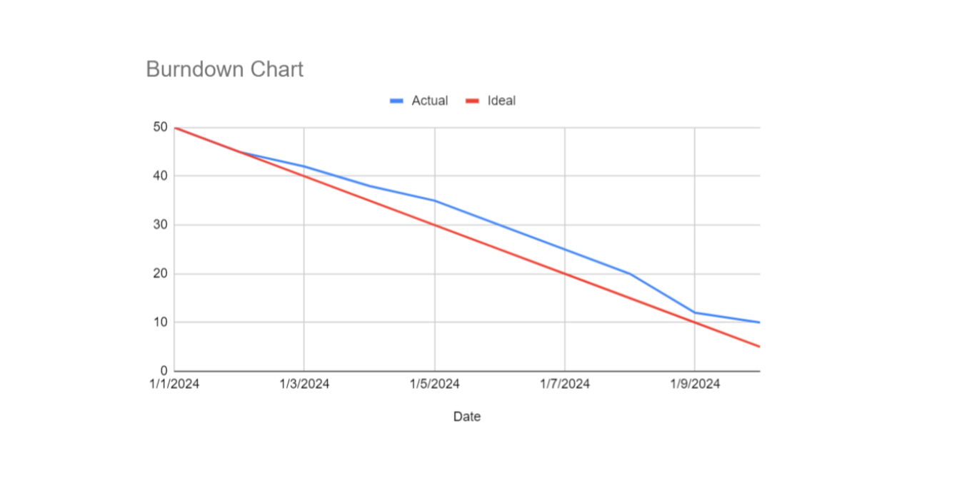
A burndown chart is a graphical representation used in project management and agile development to track the progress of a project over time. It visually displays the amount of work remaining versus the time allocated for the project, helping teams to monitor their progress and predict whether they will meet their deadlines.
What Does a Good Burndown Chart Look Like?
Here are the key components and aspects of a burndown chart:
- X-Axis (Time): This axis typically represents the timeline of the project, divided into days, weeks, or sprints.
- Y-Axis (Work Remaining): This axis shows the amount of work left to complete, often measured in hours, story points, tasks, or any other unit of work.
- Ideal Work Line: This is a straight line that slopes downwards from the total amount of work at the beginning of the project to zero at the end of the timeline. It represents the ideal progression of work completion.
- Actual Work Line: This line shows the actual progress of work completed over time. It is plotted based on real data collected during the project and can fluctuate above or below the ideal line.
What is the Purpose of a Burndown Chart?
A burndown chart serves multiple purposes:
- Progress Tracking: It provides a clear, visual representation of how much work remains and how quickly it is being completed.
- Predictive Analysis: By comparing the actual work line to the ideal work line, teams can predict if they are on track to complete the project on time.
- Identifying Issues: Deviations from the ideal work line can highlight potential issues or delays early, allowing teams to take corrective actions.
- Team Motivation: It helps in motivating the team by showing tangible progress and making it clear how their efforts contribute to the project.
How to Create a Burndown Chart in Excel
Creating a burndown chart in Excel involves several steps, including setting up your data, creating the chart, and customizing it for better visualization. Here’s a step-by-step guide:
Step 1: Prepare Your Data
- Open Excel and create a new worksheet.
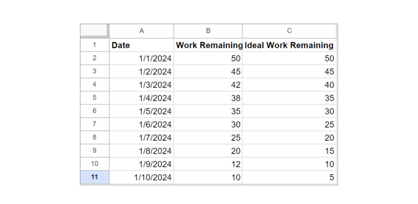
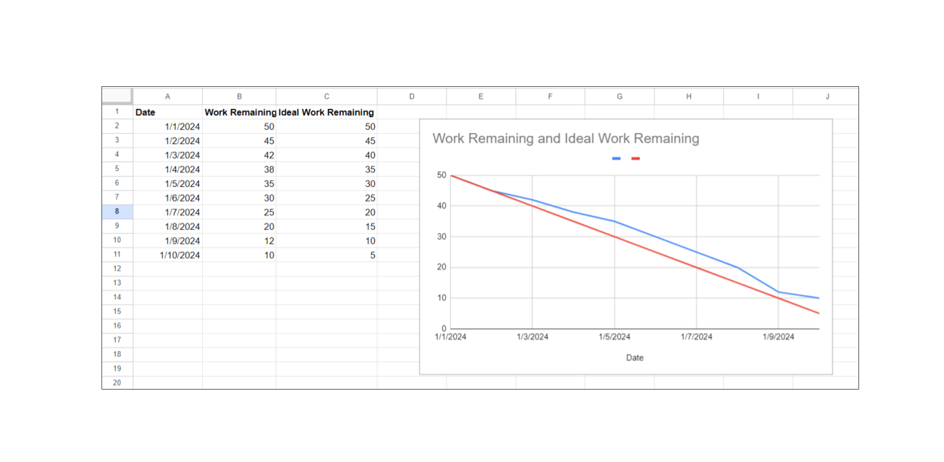
- Enter Your Sprint Dates: In column A, list the dates for your sprint. For example, if your sprint is 10 days long, you might have dates from 01/01/2024 to 01/10/2024.
- Enter Your Work Data: In column B, list the total amount of work remaining at the end of each day. In column C, create the ideal burndown line. This line should decrease evenly from the total work at the start of the sprint to zero at the end.
 Step 2: Create the Chart
- Select Your Data: Highlight the date range in column A. Hold the Ctrl key and highlight the ranges in columns B and C.
- Insert the Chart: Go to the Insert tab on the Excel ribbon. Select Line Chart from the Charts group.
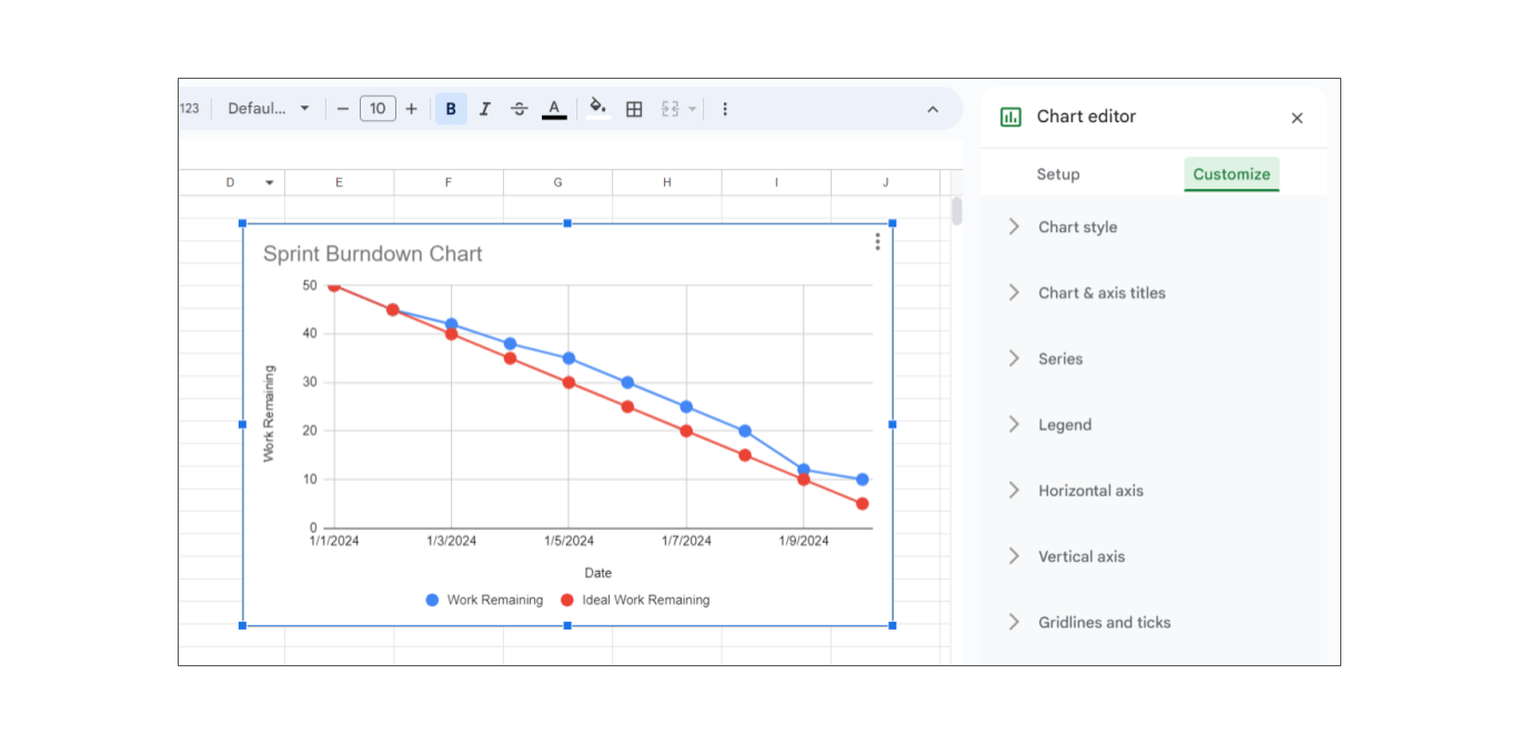
 Step 3: Customize the Chart
- Add Chart Titles and Labels: Click on the chart title to edit it (e.g., "Sprint Burndown Chart"). Add axis titles by clicking on the chart, then go to Chart Tools Design > Add Chart Element > Axis Titles and label the X-axis (e.g., "Date") and Y-axis (e.g., "Work Remaining").
- Format the Axes: Right-click on the Y-axis, select Format Axis, and set the minimum value to 0. Adjust the X-axis to show the dates properly.
- Format the Data Series: Click on the actual work line to select it. You can change the line color or style to differentiate it from the ideal work line. Do the same for the ideal work line.
- Add Data Markers: You can add data markers to the lines for better visibility by right-clicking on the line, selecting Format Data Series, and then enabling Markers.
Step 4: Update the Chart Daily
As your sprint progresses, update the "Work Remaining" column with actual values at the end of each day. The chart will automatically reflect these changes, showing your progress against the ideal burndown line.
What is a Sprint (Iteration) Burndown Chart?
While a product burndown chart tracks the progress of the entire project or product backlog over multiple sprints, a sprint burndown chart focuses on the progress within a single sprint. The sprint burndown chart is more granular and time-bound, whereas the product burndown chart provides a broader view of long-term progress.
How to See Burndown Chart in Jira
To view a burndown chart in Jira, you need to have a Scrum board set up for your project. Here are the steps to access and interpret the burndown chart in Jira:
Steps to View the Burndown Chart in Jira
- Access Your Project: Log in to your Jira account. Navigate to the project for which you want to view the burndown chart.
- Go to the Scrum Board: Select the Scrum board associated with your project. This can typically be found under the "Boards" menu in the top navigation bar, then select your specific board.
- Navigate to Reports: In the left sidebar, click on "Reports." From the list of reports, select "Burndown Chart."
- Select the Sprint: If there are multiple sprints, use the dropdown menu to select the specific sprint for which you want to view the burndown chart.
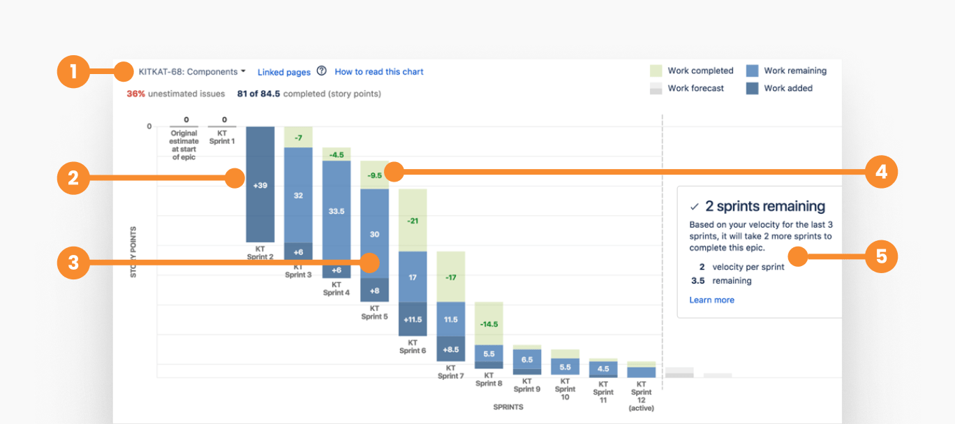
- 1--->Select epic to visualize
- 2--->Work added to the epic in each sprint
- 3--->Remaining work in the epic
- 4--->Completed work in each sprint
- 5--->Sprints to complete the epic, based on the velocity
How Does a Burndown Chart Differ from a Gantt Chart?
A burndown chart and a Gantt chart are both tools used in project management, but they serve different purposes and present information in distinct ways. A burndown chart is primarily used to track the progress of work over time, showing the amount of work remaining versus the time allocated, emphasizing how quickly work is being completed and whether the team is on track to finish the project on time.
Commonly used in Agile methodologies, especially in Scrum, burndown charts are typically updated daily to reflect the current status of work remaining and are visualized as a simple line chart with two lines (ideal and actual work remaining).
In contrast, a Gantt chart is used to plan, schedule, and visualize the timeline of a project, showing the start and end dates of various tasks and their dependencies, aiding in managing and coordinating tasks to ensure they are completed in the correct sequence and on time.
Gantt charts are commonly used in traditional project management methodologies, such as Waterfall, for detailed project planning, scheduling, and tracking of complex projects with many interdependent tasks.
They feature a bar chart format with tasks, durations, dependencies, and milestones, and are typically updated as needed, generally less frequently than daily, making them more complex but providing a detailed view of task timelines and dependencies.
Key Differences
Focus:
- Burndown Chart: Focuses on the amount of work remaining over time and the rate of work completion.
- Gantt Chart: Focuses on task scheduling, dependencies, and project timelines.
Visualization:
- Burndown Chart: Simple line chart with two lines representing ideal and actual work remaining.
- Gantt Chart: Detailed bar chart with tasks, durations, dependencies, and milestones.
Usage Context:
- Burndown Chart: Commonly used in Agile and Scrum projects for tracking sprint progress.
- Gantt Chart: Used in traditional project management for detailed planning and scheduling of tasks.
Data Update Frequency:
- Burndown Chart: Often updated daily.
- Gantt Chart: Updated as needed, typically less frequently than daily.
Complexity:
- Burndown Chart: Generally simpler and easier to create.
- Gantt Chart: More complex, providing a detailed view of task timelines and dependencies.
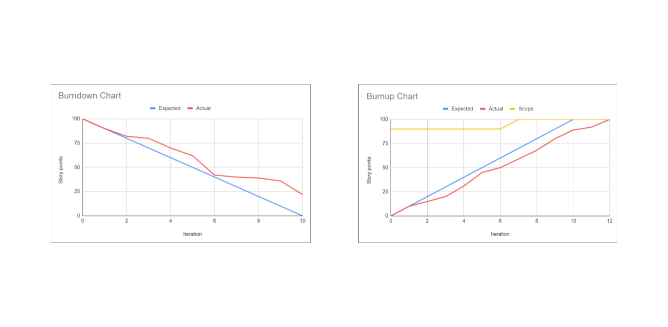
What is the Burnup Chart?
A burnup chart is a graphical representation that shows the amount of work completed and the total amount of work over time. It helps teams track their progress toward a goal and understand how much work has been done versus how much remains.
Key Components:
- X-Axis (Time): Represents the timeline of the project, typically divided into days, weeks, or sprints.
- Y-Axis (Work): Shows the amount of work, often measured in units such as story points, hours, or tasks.
- Total Work Line: Represents the total scope of the project or sprint.
- Completed Work Line: A line showing the cumulative amount of work completed over time.
Example:
Imagine a sprint with a scope of 100 story points. The total work line will be flat at 100 if there are no scope changes. The completed work line will rise as work is completed, ideally reaching 100 by the end of the sprint.
Key Differences Between Burndown and Burnup Charts
Focus:
- Burndown Chart: Focuses on the amount of work remaining and tracks the progress of work completion.
- Burnup Chart: Focuses on the amount of work completed and tracks both completed and total work over time.
Scope Changes:
- Burndown Chart: Does not easily accommodate scope changes; the chart can become confusing if work is added or removed.
- Burnup Chart: Handles scope changes well; any changes to the total scope are reflected in the total work line.
Visualization:
- Burndown Chart: Single line showing the remaining work against time, compared to an ideal work line.
- Burnup Chart: Two lines; one for total work and one for completed work, showing both progress and scope changes.
When to use:
- Burndown Chart: Useful in stable environments where the scope is unlikely to change significantly during the sprint.
- Burnup Chart: Useful in dynamic environments where scope changes are common, as it provides a clearer picture of progress relative to total work.
When is the Best Time to Review the Team's Burndown Chart?
The best time to review the team's burndown chart is during regular, structured meetings and specific points in the project timeline. Here are the optimal times and contexts for reviewing the burndown chart:

- Daily Stand-Up Meetings: Review the burndown chart to get a quick update on the team's progress, identify any impediments, and adjust plans for the day. This helps the team stay aligned and address issues promptly.
- Sprint Planning Meetings: Use the burndown chart from the previous sprint to review how well the team met their goals and to help with planning and estimating tasks for the upcoming sprint. This retrospective look can guide better planning and resource allocation.
- Sprint Review Meetings: Evaluate the overall progress and outcomes of the sprint by reviewing the burndown chart. Discuss what went well, what didn’t, and what can be improved in future sprints.
- Sprint Retrospective Meetings: Reflect on the burndown chart to understand the team's performance, analyze any deviations from the planned progress, and identify areas for process improvement.
- Ad-Hoc Reviews: When unexpected issues arise, or there are significant changes in progress, review the burndown chart to make necessary adjustments and communicate the status to stakeholders.
Who Updates Sprint Burndown Chart?
The sprint burndown chart is typically updated by the Scrum Master or a designated team member responsible for tracking progress. However, the entire Scrum team collaborates to ensure the data is accurate and reflects the current state of the sprint. Here’s a breakdown of the roles and responsibilities involved in updating the sprint burndown chart:
Scrum Master:
- Primary Responsibility: The Scrum Master is usually responsible for maintaining and updating the sprint burndown chart.
- Daily Updates: Ensures the burndown chart is updated daily with the latest information on tasks completed and work remaining.
- Facilitation: Facilitates discussions during daily stand-ups about the progress reflected in the burndown chart.
Team Members:
- Task Updates: Each team member is responsible for updating the status of their individual tasks in the task management tool (e.g., Jira, Trello, or any other Agile project management software).
- Reporting Progress: During daily stand-up meetings, team members report on their progress, which the Scrum Master uses to update the burndown chart accurately.
- Accuracy: Ensure that the work estimates and remaining efforts are accurately reported to reflect true progress.
Product Owner:
- Monitoring Progress: While not directly responsible for updating the burndown chart, the Product Owner uses the chart to monitor the progress of the sprint and ensure the team is on track to meet the sprint goals.
- Stakeholder Communication: Uses the information from the burndown chart to communicate progress to stakeholders.
Conclusion
Burndown charts are essential tools in agile project management, providing clear visual insights into the progress of work over time. They help teams track remaining tasks, predict project completion, and identify potential delays early on. While simpler and more focused on work completion compared to Gantt charts, which are detailed and complex, burndown charts offer a straightforward way to monitor sprint progress.
In dynamic environments, burnup charts might be preferable due to their ability to handle scope changes effectively. Regularly reviewing and updating the burndown chart ensures accurate tracking and helps teams stay aligned with their project goals, fostering a collaborative and efficient working environment.
About the Author
Violetta Chernobuk is a skilled content strategist and writer at Planyway, specializing in crafting insightful and engaging articles on productivity and project management. With her keen eye for detail and a deep understanding of user needs, Violetta ensures that every piece of content is both informative and inspiring, helping readers optimize their workflows and stay ahead in their projects.