How to create custom reports and charts in Jira for better insights

Reporting is the part of Jira that people tend to have opinions about. You have plenty of Jira data sitting in your projects, but turning it into something that answers your particular question can feel surprisingly difficult. That reputation isn't entirely fair — Jira gives project managers more ways to track progress than it gets credit for.
This guide walks through building custom reports and charts in Jira and using them to keep a clearer view of your projects.
TL;DR
- Jira gives you three native ways to build a report: filters and JQL, built-in reports like Velocity and Cumulative Flow, and dashboards made of gadgets. A custom report is these three pieces combined around a question you define yourself.
- Most people build a custom report backwards, picking a chart type before they've decided what their report is for. Start by asking the question first, then decide which filter, grouping, and chart type will answer it fully.
- Two things don't work well natively in Jira: combining data across projects and sharing a live report with someone outside your instance. The Two-Dimensional Filter Statistics gadget splits identical components by project ID, so they show up as separate rows. Reports meant for clients or executives end up as either a public link or a static PDF.
What are Jira custom reports?
A custom report is any view of your Jira data that you configure yourself, rather than pull straight off the shelf. It can be as simple as a saved filter or as involved as a full dashboard built from several gadgets. Either way, the point is that you're building your own summary of your project that answers a specific question.
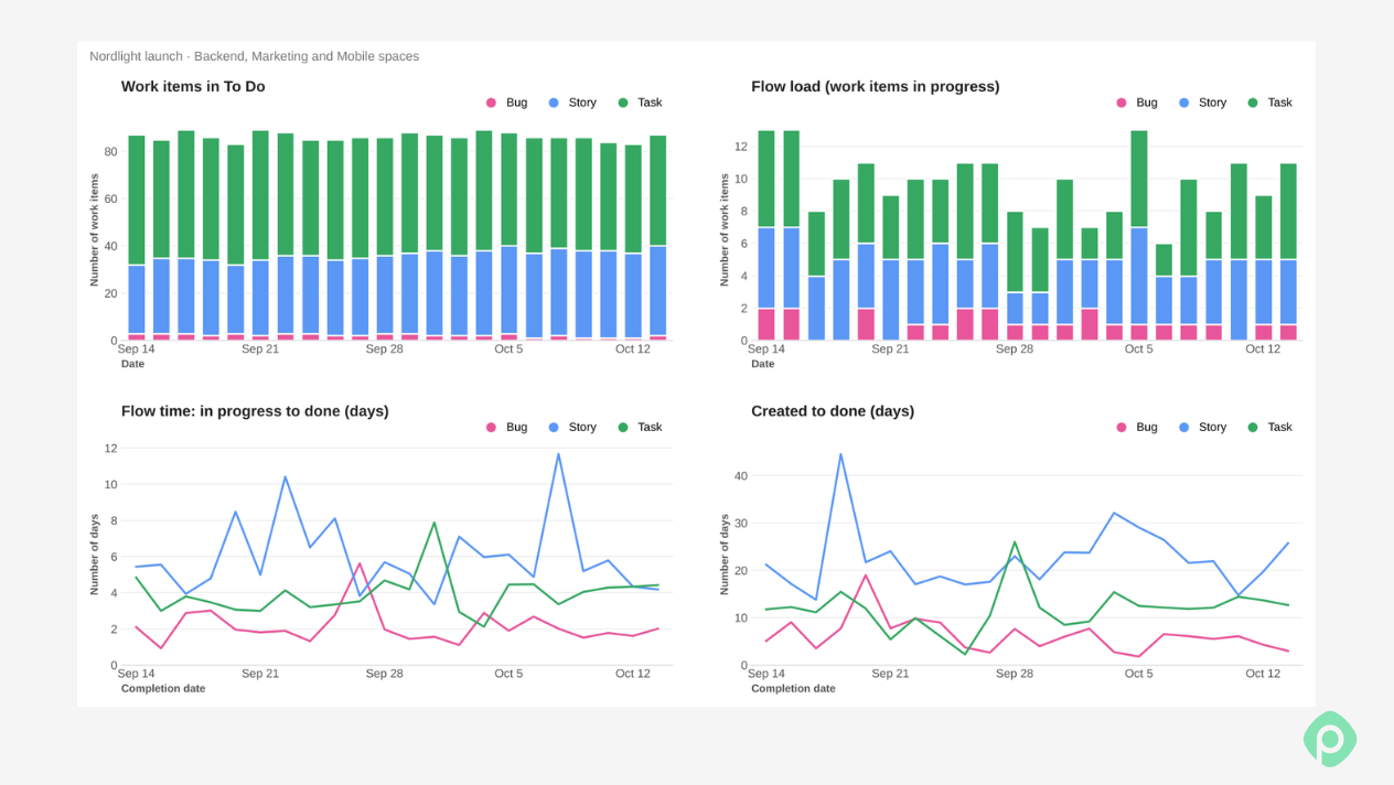
In practice, teams reach for custom Jira reports in a handful of recurring situations. A delivery manager needs a view that spans multiple projects, which no default report does on its own. A Jira admin on a Jira Service Management or Jira Work Management project needs a chart their project type doesn't ship with. An agile team lead wants to track team performance across a few sprints instead of just one. Sooner or later, someone on the team opens the report builder and starts to create custom Jira reports.
Three levels of Jira reporting
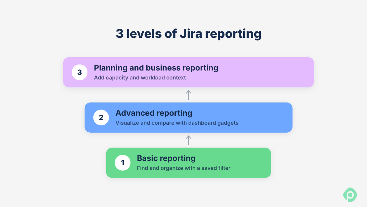
In practice, Jira's reporting works on three levels. It’s useful to know which one you're operating on before creating a filter or a chart:
- Basic reporting is about finding and organizing. A saved filter is often all you need here: all open bugs, everything assigned to one person, issues due this week.
- Advanced reporting is about visualizing and comparing. This is where saved filters, dashboard gadgets, and Jira's four reports per-project-type baseline (roughly speaking) come together — issues by status, story points per sprint.
- Planning and business reporting ask questions a single issue can't answer. Will the next sprint fit your team's capacity? Who's overloaded across several projects? Reporting and planning overlap at this level, and it's where a planning tool like Planyway belongs.
Keep that ladder in mind going forward. Frustration with Jira reporting tends to come from answering a level-three question with a level-one tool.
What Jira reports you get by default
Jira already has a report for a lot of what people try to build themselves. Worth a look through the reports menu before you open the report builder to draft a new report yourself.
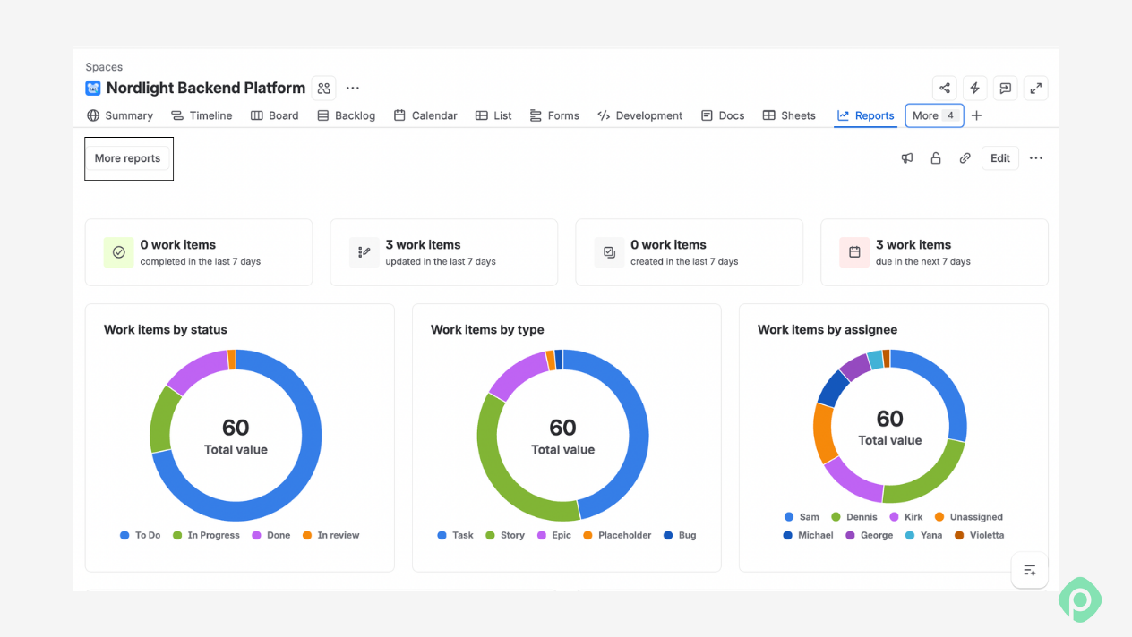
You can select reports like the Velocity report, the Cumulative flow diagram, or the Control chart, and Jira builds the chart from your existing sprint data. These default reports cover most of what a scrum team checks weekly: how much work got done, how long issues sit in each status, where the flow is stuck.
The Workload pie chart report breaks down time tracking estimates by assignee. The Created vs. Resolved report plots issues created against completed tasks over a date range. The average time in Status report shows how long issues sit at each stage, which beats guessing when someone asks why something is taking so long.
Most Jira issue analysis reports use a single-level group — one field, rendered as a pie chart or a line. This makes them quick to open and quick to outgrow: once your question involves two dimensions at once, like status and assignee together, a default report can't quite get there. At that point, custom reporting takes over.
Company-managed vs. team-managed projects (and why Jira software reports differ)
If your Reports menu looks nothing like your teammate's, you most probably have different project types. Which native reports you get depends entirely on what kind of project you're in.
- Company-managed projects get the full set of Jira Software reports: Velocity, Sprint Burndown, Cumulative Flow, Control Chart, Epic Burndown, and more.
- Team-managed projects get only six: Burnup, Sprint burndown, Velocity, Cumulative flow, Cycle time, and Deployment frequency.
Project types outside Jira Software have their own rules, too. Jira Work Management projects get almost none of the software report set. Jira Service Management has its own separate report builder entirely, built for tickets and SLAs, with no overlap.
So please, check your Jira project type before assuming a missing report is your mistake.
How to build a custom report in Jira, step by step
Every custom report in Jira starts with a saved filter. And every good saved filter starts with a question.
Step 1: Start with the question
The question comes first. “Which team members have the most unresolved work?” points you at the filter you need, while “I need a pie chart” leaves you guessing. Get the question right, and the filter follows.
Some reporting questions don't need a chart at all — a filter may already get you there. Work out what you're actually after: Do you want a visual, or do you want a list you can scan?
“Who's got open bugs right now?” and “What's overdue this week?” are both answered by a saved filter. You get a list, sorted and grouped the way you want, and that's enough.
A chart makes sense when the question is about a pattern. How work trends over time, how one team compares to another, and whether a backlog is growing too fast.
Step 2: Build and save the filter
You can build the underlying dataset two ways: the drop-down menu filter builder or JQL directly. If you already know JQL query syntax, it's usually faster — for example:
project in (NMA, NBP, NLM) AND priority in (High, Highest) AND statusCategory != Done
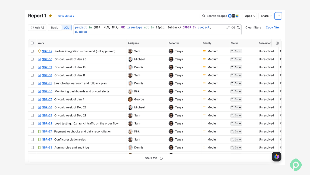
Small, clearly named filters beat one large query behind a dashboard. They're easier to debug and easier to hand off. Save each one with a name that explains what it does. And set the viewers’ settings to the whole organization, so other people can actually use it.
Saving a filter is what makes it reusable. One saved filter can feed several dashboard views at once: a Filter Results gadget, a pie chart, a filter statistics gadget. They all read from the same data. Dashboards point at the filter itself, so when you edit it, every chart built on it updates on its own.
Step 3: Pick a chart
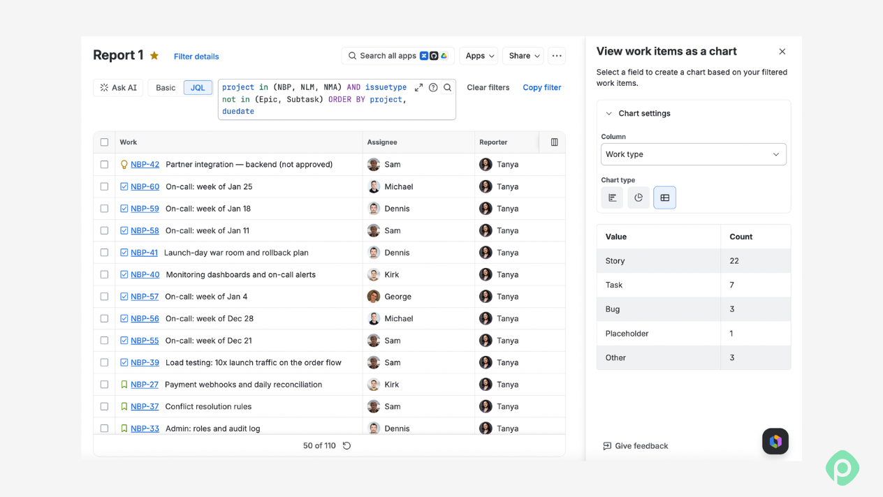
With your filter saved, the question becomes which chart actually shows the answer. Match the chart to what you're trying to see, not the other way around.
| If you want to... | Use... |
|---|---|
| Compare categories | Bar chart |
| Show proportions | Pie chart |
| Show change over time | Line chart |
| Compare two dimensions at once | Two-dimensional statistics |
| Track sprint progress | Burndown |
| Compare delivery across sprints | Velocity |
| Understand flow | Cumulative flow diagram |
| Understand cycle time | Control chart |
A quick test: if your question has the word “how many” in it, you probably want a bar or pie chart. If it has "over time" in it, you want a line, burndown, or cumulative flow. If it has “compared to” two things at once, that's your cue for a two-dimensional gadget.
Step 4: Configure the report
Grouping is the final piece of a custom Jira report, and it's where the question you started with comes back. The report configuration screen offers the usual fields to group by (assignee, status, priority, issue type, sprint, and component). Asking who has the most unresolved work points to assignee; asking where work is piling up points to status.
The two-dimensional filter statistics gadget lets you group by two fields at once instead of one. One of the very common pairings is assignee-by-status. It answers two questions in one view: who has work, and where that work is stuck.
Conditional formatting highlights the numbers that matter, like overdue counts in red, so the report is easier to scan. If you're building this for in-depth analysis, check whether the grouping gains insights the issue list underneath can't show by itself. Otherwise, you've added steps to the filter for nothing.
Step 5: Build the right dashboard for the right audience
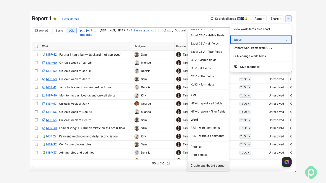
Who opens a dashboard shapes what goes into it, sometimes more than the data itself. A view built for a dev team looks nothing like one built for an executive.
- A dev team's sprint dashboard usually needs tactical detail: burndown, unresolved bugs by priority, work by assignee. That's what someone checks daily to figure out what to pick up next.
- A PM watching project health trades some of that detail for a wider view. Cumulative flow, cycle time, a couple of two-dimensional gadgets showing where work is stuck across the whole project.
- An executive's delivery dashboard goes even thinner. Velocity trend, the percentage of deadlines hit, and one chart per question a leader tends to ask in a status meeting.
All three dashboards pull from the same filters. The audience is what changes, and with it, what you put on the screen.
Worth pausing here. If you followed the step by step guide above (question → filter → chart → grouping → audience), you should have a custom Jira dashboard that actually answers your question.
Where native Jira reporting hits a wall
Everything so far assumes you're reporting inside one project for people who already have a Jira seat. That covers a lot of day-to-day work, but it doesn't cover everything.
Rolling up data across projects
Say you manage three teams, each with its own Jira project, and you need one combined view — total open bugs, say, across all three. The Two-Dimensional Filter Statistics gadget looks like it should handle this, but it groups data by internal project ID, not by name. A component called “Backend” in all three projects shows up as three separate rows in the gadget. Nothing's broken here. The gadget was built to group by project ID. So once you need numbers across more than one team, the report usually ends up in a spreadsheet. Someone copies the figures out of Jira, adds them up again, and does it all over next sprint.
Sharing with people outside Jira
The second wall shows up whenever you need to share reports with someone who doesn't have a Jira license — a client, an executive, a stakeholder from another department. Jira gives you two options here, and neither one is clean. You can make a dashboard public, which means anonymous, unauthenticated, link-has-the-whole-thing public—fine for a marketing site, not fine for a project with client names and deadlines in it. You can also export a PDF and email it. Fine for a one-time snapshot, but the file won't reflect if you change anything afterward.
This has been an open question on Atlassian Community since at least 2019: how do I share a live report with non-Jira users without making it public? No answer yet. Track progress on a project with someone outside your Jira instance, and native Jira has nothing for it.
Getting data out of Jira: Excel, Sheets, or Power BI
Sometimes you need to get the data out of Jira entirely. This comes up more than people expect, and not always by choice.
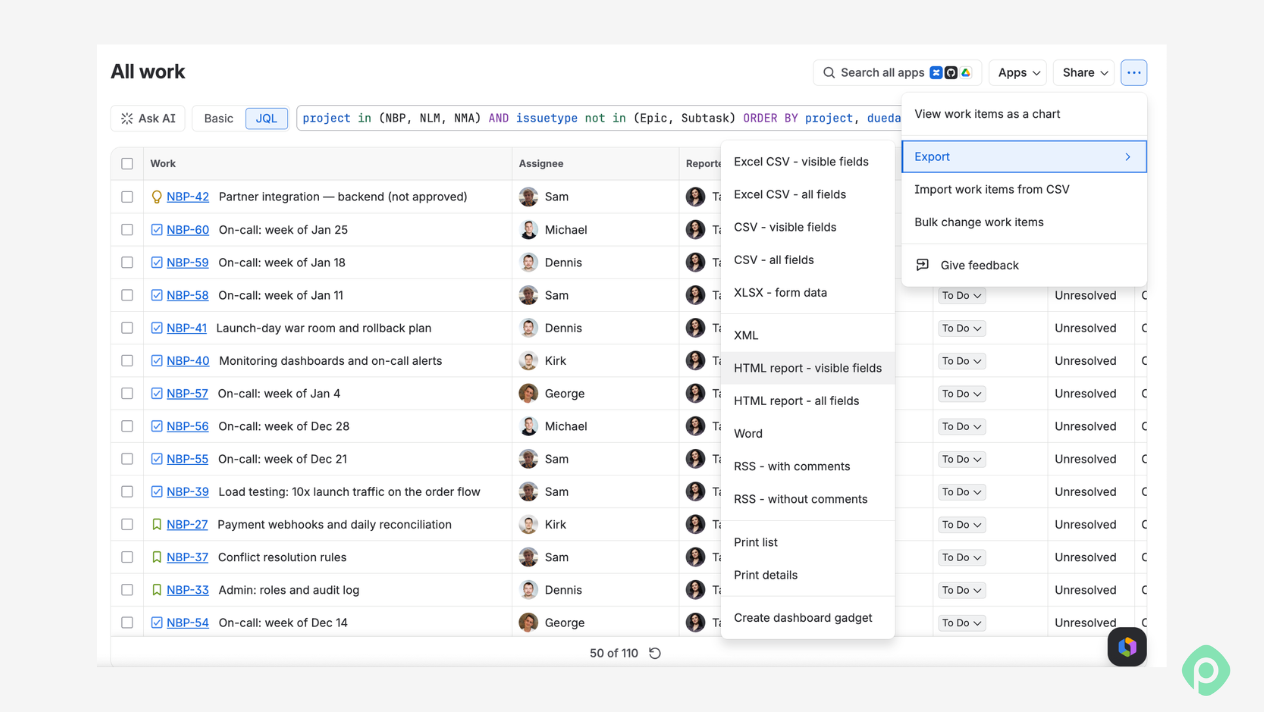
The usual reason is when you need to hand project data to someone who works in a different tool or combine it with numbers Jira doesn't have. A finance team wants issue counts next to budget figures already sitting in a spreadsheet. An exec wants a BI tool dashboard that blends Jira delivery metrics with data from three other systems. In both cases, exporting Jira data is the fastest way to connect Jira to a workflow that lives somewhere else.
There's another trigger that's easy to miss: security policy. Some organizations run Atlassian Guard, and a configuration in it can block native CSV export. If that happens to you, nothing is broken in your account. The block is a deliberate setting, usually there to control where company data can go, which means finding another route out, like an app that syncs Jira issues to a spreadsheet or BI platform.
Where the data ends up usually depends on how often you need it:
- Google Sheets or Excel work well for a one-time pull or a report someone will tweak by hand.
- Power BI or another BI platform makes more sense when the export needs to refresh regularly and feed into a bigger picture across several tools.
The export itself is rarely the hard part. Deciding what data actually needs to leave Jira, and how often, is.
Planyway for Jira: reports you don’t have to build
Native Jira is a good place to start. But at some point, you'll need something the default reports and gadgets don't do: real cross-project rollups, more flexible charts, data from more than one source, or reporting that's tied to planning instead of sitting next to it. When that happens, you might need to add dedicated apps that have tailored reports and advanced features built to close exactly that gap.
Planyway for Jira, which is our all-in-one app for cross-project planning, is one of those apps. Planyway adds planning views on top of your existing Jira data, and each one looks at that data from a different angle:
- The timeline shows what’s happening when, across all your projects, at any scale.
- The workload view shows who has capacity and who’s overloaded.
- Time tracking shows how many hours actually went into the work.
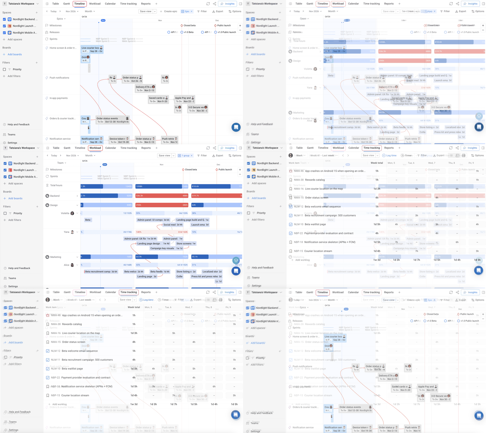
Filter any of them down to the projects you need, group however you need it (by team, assignee, epic, and spaces), and that’s the answer you can take straight to your next status meeting.
Planyway also has a few ready-made reports that build themselves from your Jira data, so there’s nothing to set up.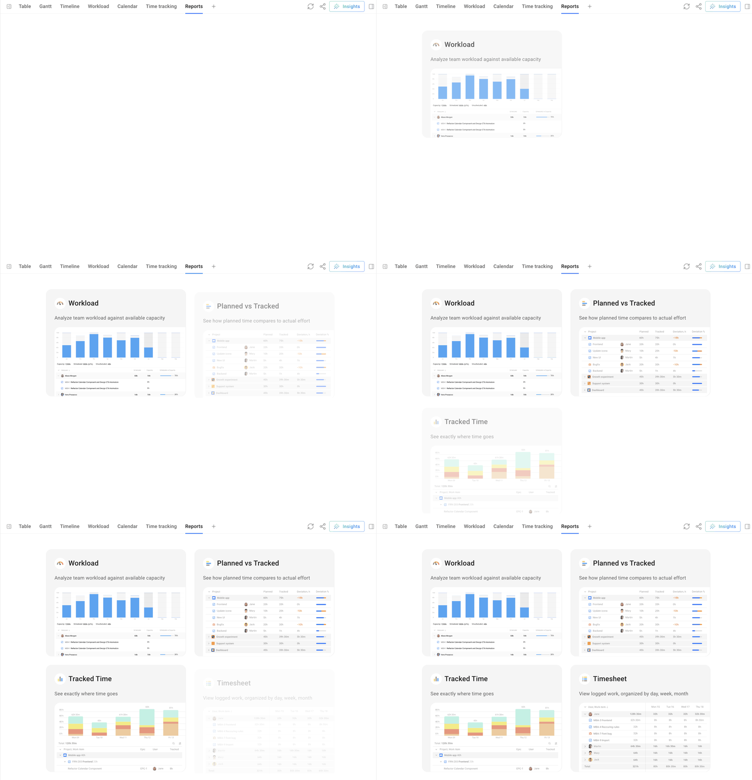
Which reporting path fits you
The right tool depends on the question, so work up the ladder we set out above, one step at a time.
For a quick look at open bugs or what's overdue, a default report or a saved filter is enough.
Something you or your team checks regularly deserves a saved filter on a dashboard. Custom Jira reports usually amount to exactly that, and they handle most recurring questions on their own.
Once you're rebuilding the same view every week by hand, or the question involves capacity and planning rather than just counting issues, that's the signal to bring in a marketplace app—Planyway if the question is about workload and planning, a charting app if it's purely visual.
And once the data needs to leave Jira entirely—finance, an exec's BI dashboard, another project management tool — export or connect to a BI tool instead of forcing it into a Jira dashboard.
There's no single right answer here, just the right one for the question you're actually trying to answer this week.


FAQ
Building reports in Jira starts on your project board. Open Reports to find the built-in ones like Velocity, Sprint burndown, and Cumulative flow. Which ones you see depends on your project type. Pick one, set the report parameters (sprint, date range, or field), and Jira generates a fresh report from your current data. If none of them fits, create a saved filter and build your own custom report on top of it. Anything you'll check again belongs on a dashboard.
To build Jira custom reports, start with a saved filter. You can set it up in the drop-down filter builder or write it in Jira Query Language (JQL), and scope it to a specific project or pull issues from multiple Jira projects at once. Then create reports on top of it with a chart or a dashboard gadget. The filter decides what's in the report, and the chart decides how it looks.
They fall into four groups: built-in agile reports like Velocity and Sprint burndown for tracking team velocity and sprint progress, saved filters, dashboard gadgets that turn those filters into issue statistics and charts, and Jira Service Management's own report builder for tickets and SLAs. Most custom reports are a mix of saved filters and gadgets.
Not a full one. Jira's Timeline view comes closest: it shows dates and dependencies for issues in a project, and on Jira Premium, Plans can stretch that across several projects. If you need a proper Gantt chart with team workload and advanced resource management in the same view, a Marketplace app like Planyway covers that.
Custom charts for Jira come from combining a saved filter with a dashboard gadget like Pie Chart, Two-Dimensional Filter Statistics, or Created vs. Resolved Chart. Create a dashboard, add the gadget, and point it at your filter. The field you group by, like assignee, status, or priority, shapes the chart and decides what kind of management reports you end up with. For deeper insights, like putting Jira data next to business performance numbers from other tools, teams usually export it to a BI platform.