10 free Gantt chart templates for Excel (instant download)

A Gantt chart looks simple: a task list on the left and horizontal bars on a calendar grid on the right. Then you want the bars to show task dependencies and slipped dates, or visualize who's carrying too much this week, and it stops being simple.
At Planyway, we’ve spent years building project timeline views for Jira teams, so we’ve heard our fair share of planning headaches. And a lot of them are the same: unclear deadlines, shifting priorities, too many dependencies, and more. So we put together 10 free Gantt chart templates for Excel, each designed around a different planning problem. We’ll also tell you who each one works best for — and when you’re better off looking elsewhere.
10 Gantt chart templates for Excel, one for each planning problem
Every Excel Gantt chart template here is built around one planning job rather than trying to cover everything. Gantt chart templates built this way run from most universal to most specialized, so if you're not sure where to start, start at the top. All of them are ready-made templates as plain .xlsx files. Microsoft Excel opens them, and Google Sheets does too. The bars redraw themselves when you fill in your own project tasks.
📌 If a spreadsheet isn't enough, Planyway's Gantt chart builds the same kind of timeline straight from your Jira issues. It pulls several Jira spaces into one Gantt, follows your real hierarchy (from Epic to Subtask, plus custom levels like Initiative or Program), and stays in sync as work moves.
1. Classic Gantt
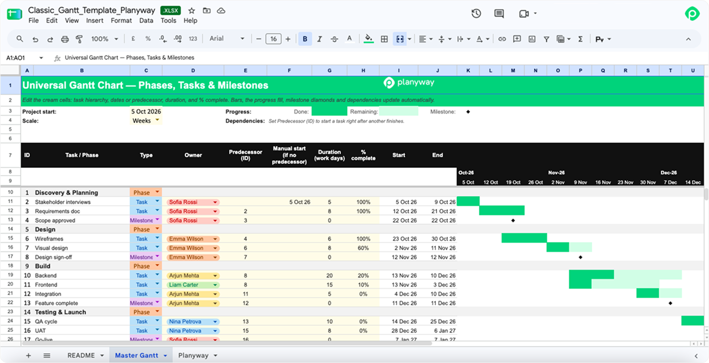
This is the all-purpose Gantt template, and the one we'd hand to most people first. Project phases group individual tasks underneath. Each bar fills in from the left as percent complete grows, and milestones mark the dates that matter. Simple task dependencies link one bar to the next, and you can toggle between days and weeks.
Unlike a detailed Gantt chart template, this one skips the fluff and works well for most medium-sized projects where you need a single project plan and a simple way to track progress against it.
2. Gantt-style software delivery roadmap
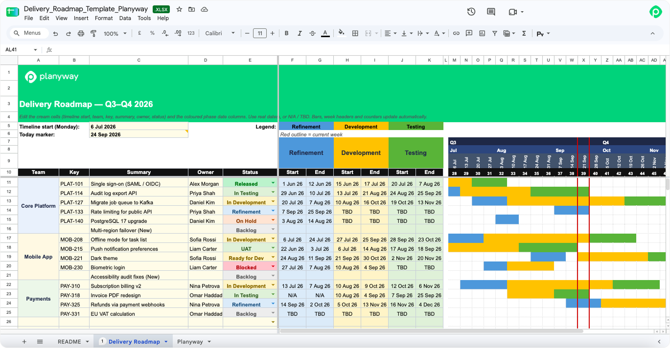
A classic template gives each task one pair of dates. This one gives it three: Refinement, Development, and Testing. That's how product teams already work, since every item goes through all three before it ships. So each phase gets its own start and end dates and its own colored segment on the bar. Next to the dates, each row shows the owner and the task status, from Backlog and Ready for Dev to In Testing, UAT, and Released, with Blocked and On Hold for work that's stuck.
To delivery managers and team leads, this one shows what phase every item is in and when it's due for production. One caveat is that dates and task status are updated by hand, so the chart is only as current as the last person who edited it.
3. Simple Gantt
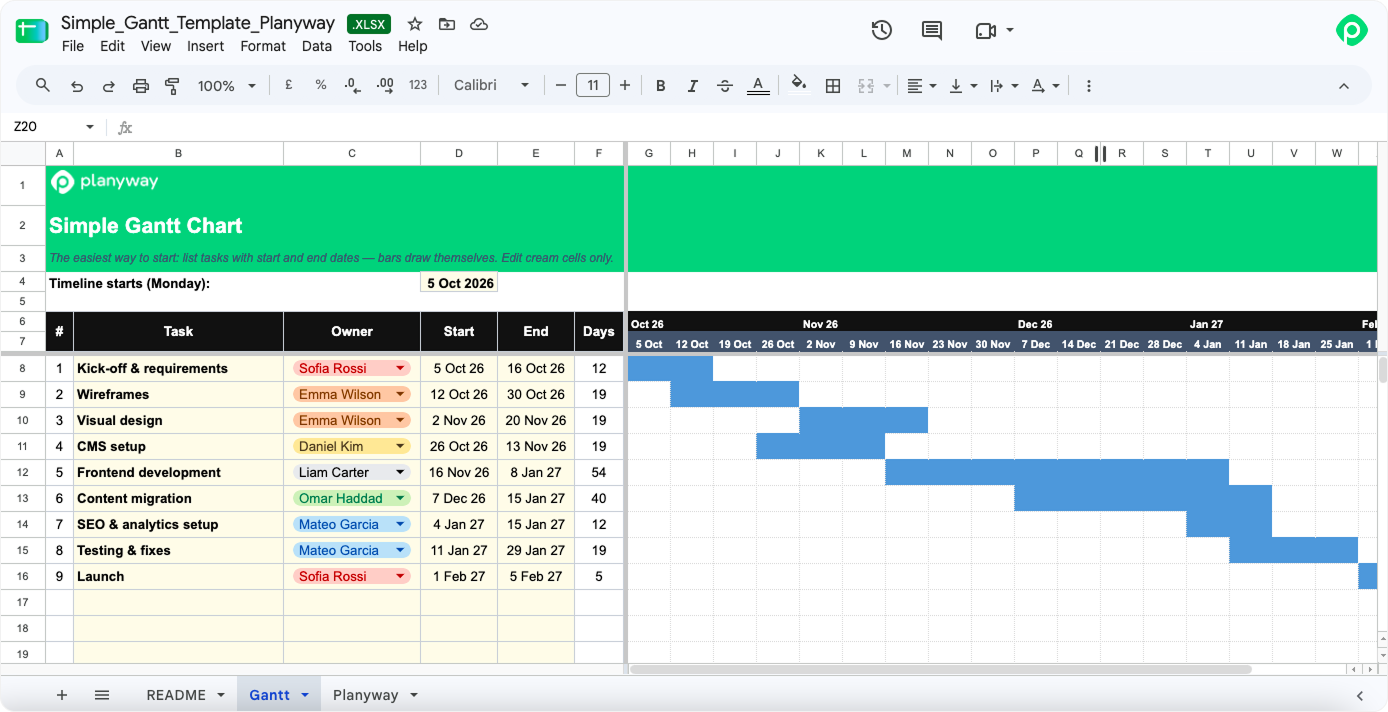
A first simple Gantt chart template for someone who's never built one. Assign tasks to an owner, enter a start date and an end date, and the bar appears on its own. It's about as lean as a basic Gantt chart template gets.
It’s perfect for a simple project, the kind that runs a couple of months: a website launch, a new tool rollout, a team moving offices. Think of it as a basic project timeline and nothing more. Once you need dependencies, percent complete, or variance tracking, this template has nothing left to give.
4. Critical Path Gantt
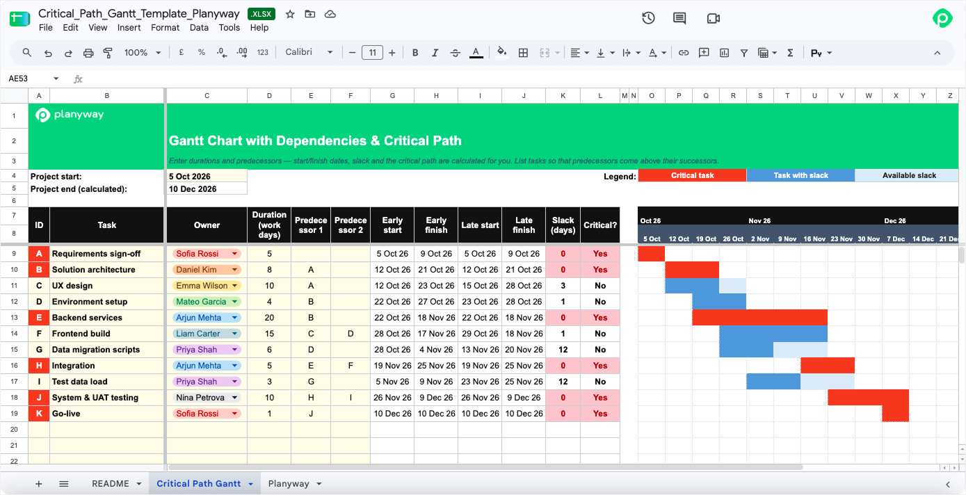
This template is designed for projects where the order of work matters more than the list itself. Fill in task duration and predecessors for each row. Start and end dates in working days get calculated for you. Tasks depend on each other, sometimes with multiple dependencies. One predecessor slips, and the sheet will automatically adjust every date downstream.
The critical path gets highlighted, while the slack per task is visible next to it. That answers the two questions project leads hear most often: what can't move, and how late can this task run before the deadline goes with it.
5. Plan vs Actual (baseline) Gantt
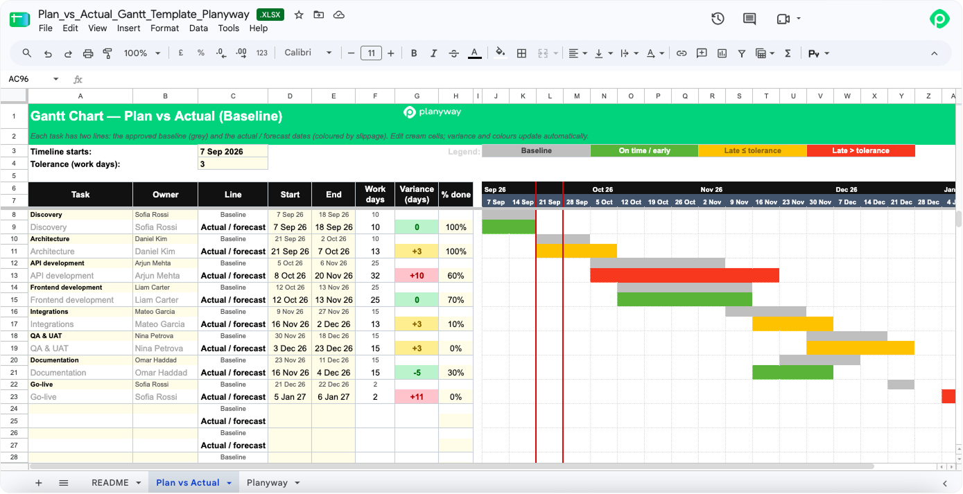
This template is built for tracking variance once the plan has been signed off. Every task gets two rows: the locked baseline and the actual or forecast dates, and the bar colors show how late each task is against the tolerance you set.
It's the one to bring to a client or leadership review, since it covers both project status and actual progress, along with how far you've drifted from what you promised. With the baseline and actual dates side by side, you have numbers you can defend in a meeting, and the project's progress becomes something a sponsor can read at a glance. Just keep in mind that it only makes sense on projects where the plan gets frozen at some point.
6. Resource Gantt
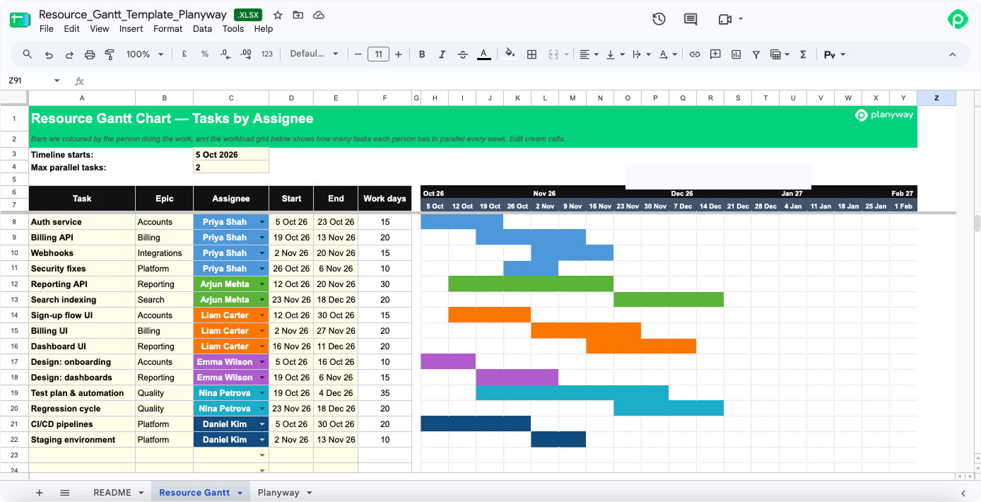
Reach for this one when your bottleneck is people and their available capacity. Bars are colored by assignee, and a panel underneath counts how many tasks each person has running in parallel every week, with overloads called out. It also flags potential bottlenecks a few weeks out.
This template helps you answer questions like "Can we make the date if Priya is already on three things?" before you hand her more tasks. There's still time to reshuffle.
7. Sprint Gantt
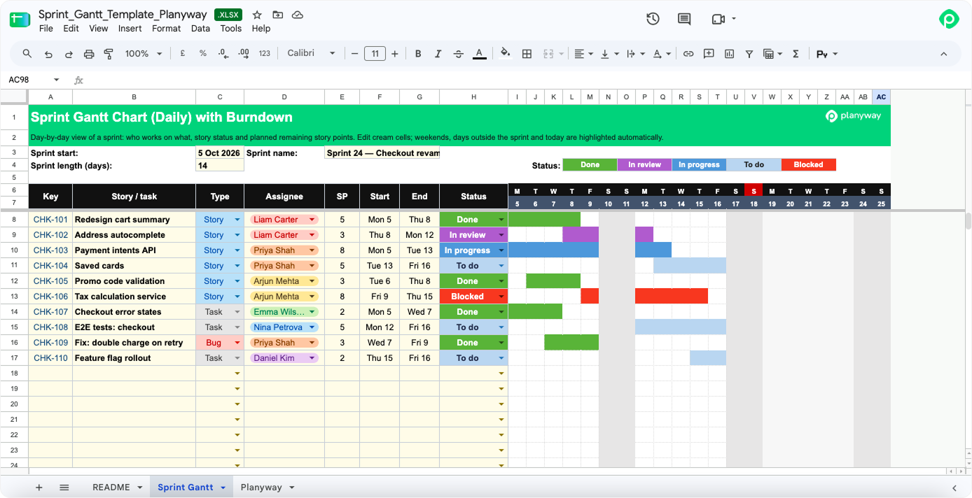
This Gantt chart zooms in to a single sprint on a daily scale, with weekends marked and each bar colored by its task status, plus a burndown chart to show whether the team is on pace. It's for Scrum teams whose board doesn't quite answer the question "Who's doing what on Thursday, and will we make the demo?" The horizon tops out at three weeks, though, so it won't stretch to cover longer work.
8. Program / Multi-project Gantt
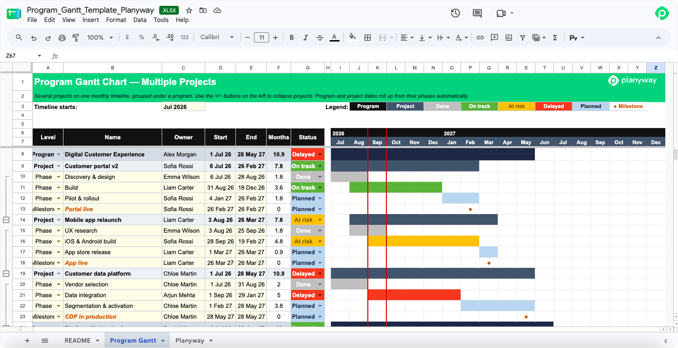
You can turn to this template when you run multiple projects and leadership wants them on one screen. The structure here runs program → project → phase, with dates and status rolling up from the bottom and phases collapsing when you don't need the detail. On a monthly scale with an 18-month horizon, it answers questions like "Where's the red in the portfolio?" and "Which projects will collide in the same quarter?"
9. Gantt with budget tracking
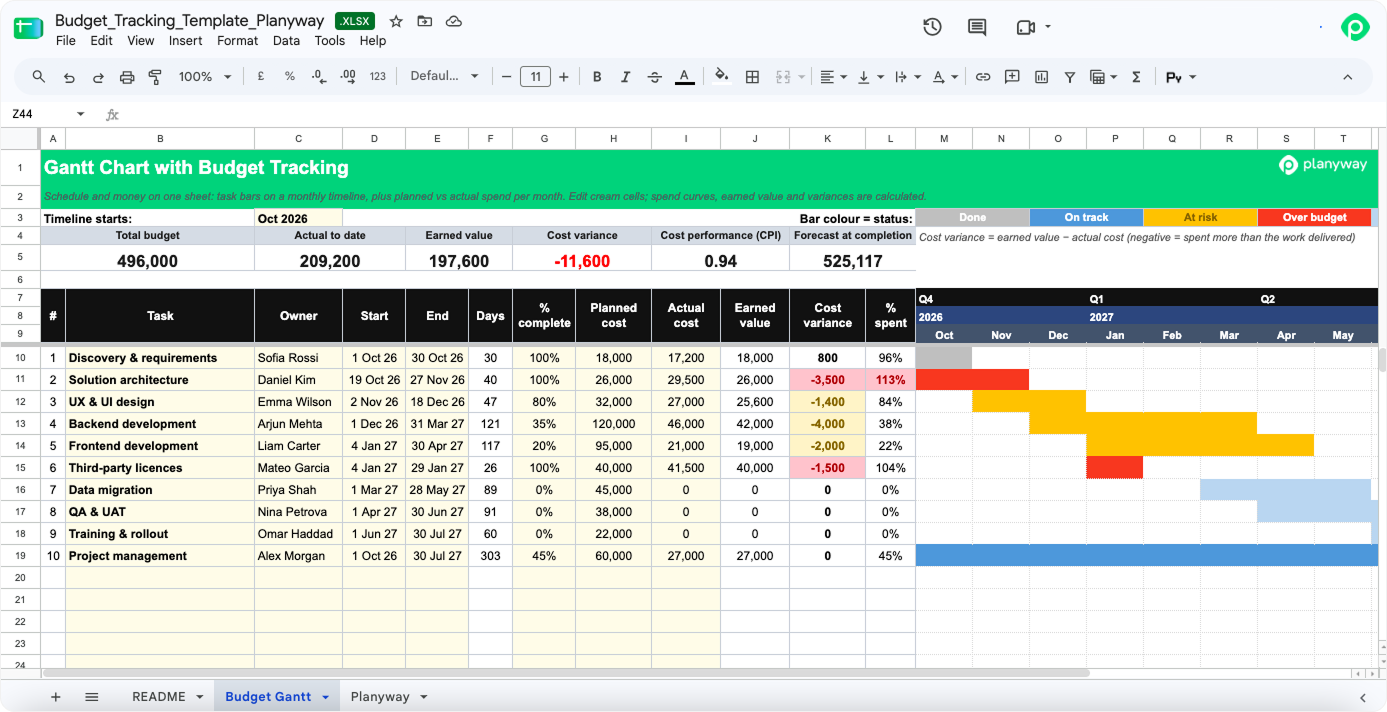
If you need to see dates and money on the same sheet, this Gantt chart template might address your need. It's built for projects with an approved budget, where overspend questions come up as often as deadline questions. Bars run by month, colored by the state of the budget. If your sponsor reviews spend monthly, this is the artifact to bring to that meeting.
10. Milestone Gantt
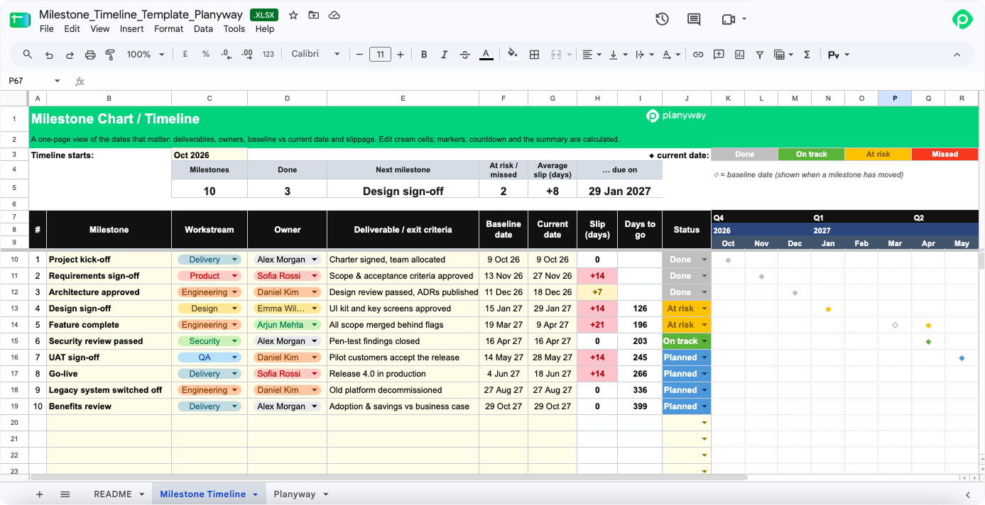
This one is for stakeholders who want one page and no task detail. Each milestone appears as a single marker on the timeline, showing where it sits today and how far its date has moved from the baseline. A summary at the top shows how many milestones are done, which one is next, and how many are at risk. You get a visual picture of the entire project without the row-by-row noise.
How to use these templates
All ten work the same way. Download the file, open it in Google Sheets or Excel, and edit only the cream-colored cells. Bars, dates, colors, and totals recalculate on their own.
- Check the "How to use it" tab. Each file has its own README.
- Set your start date. Near the top of each file, there's a "Timeline starts" cell, sometimes labeled "Project start." Change it and the week or month headers shift with it.
- Add your tasks. Type over the sample rows, or add new ones below the last row. The formulas and formatting extend on their own.
- Edit only the cream cells. Bars, totals, and status colors calculate themselves. Unsure whether a cell is meant to be edited? Check its color.
Not sure which one to pick?
Which question do you hear most? Most project managers we talk to can name theirs right away, and it points straight at a template.
| The question you keep hearing | Template to start with |
|---|---|
| Where are we overall? | Classic Gantt |
| When will this reach production? | Software delivery roadmap |
| What can't slip? | Critical Path Gantt |
| How far are we from the original plan? | Plan vs Actual |
| Who's overloaded next week? | Resource Gantt |
| Will we make the demo? | Sprint Gantt |
| Which projects clash next quarter? | Program Gantt |
| Are we still within budget? | Budget tracking |
| What changed since the last update? | Milestone Gantt |
If two questions feel equally urgent, pick the template for the one that would hurt more to get wrong. You can always add one more sheet later.
What a Gantt chart is usually made of
Put the colors and formulas aside, and every Gantt chart shows the same task data: what needs to happen, when, in what order, and how far along it is. Most Excel Gantt charts are a stacked bar chart with the first series hidden, so each bar starts on its start date and stretches for its duration. This works in any Gantt chart spreadsheet, and it also breaks the moment someone sorts the rows the wrong way.
Below is what goes into one, and which templates above lean on each part the most.
| Element | What it shows | Where it matters most |
|---|---|---|
| Task list | All the tasks in the project, often grouped into phases | Every template |
| Timeline scale | Days, weeks, or months across the top | Sprint (days), Program (months) |
| Task bars | Each task's start and end dates as a bar on the project timeline | Every template |
| Task duration | How long each piece of work takes, in calendar or working days | Critical Path |
| Task dependencies | Which tasks can't start until another one finishes | Classic, Critical Path |
| Milestones | Key dates with zero duration, shown as diamonds | Classic, Milestone |
| Percent complete | Task status for each bar | Classic, Sprint, Plan vs Actual |
| Owners | Who's responsible for each task | Simple, Resource |
No chart template needs all of these. The Simple Gantt above uses three or four, and that's its strength. Pick only the elements your project schedule depends on. That keeps it readable instead of turning it into another thing to maintain. The templates above also work as Gantt chart examples. Open two or three side by side and compare.
Where spreadsheets run into trouble
A Gantt chart spreadsheet is great for sketching a new project. But once work starts moving, it can quickly grow stale, because project data usually lives somewhere else. Besides, one person tends to maintain the file, and there's no clean way to comment on tasks or attach files. Complex projects with complex dependencies outgrow formulas, and keeping an Excel version per team across multiple projects gets messy fast.
That's where dedicated Gantt chart software pays off. Planyway for Jira builds the timeline straight from your Jira issues, and when you drag a bar, the dates update in Jira. Dependencies, workload, and all your projects fit on one visual timeline, with advanced features there when you need them. The whole team keeps the plan current, so successful delivery doesn't hang on one person's update.


FAQ
To create Gantt charts, list your key tasks with a start date and a task duration for each, then plot them as bars on a calendar grid. In a spreadsheet, that means either a stacked bar chart or conditional formatting across date columns. Faster: open one of the templates above and replace the sample rows with your own. If your tasks already live in Jira, a visual tool will automatically generate the bars for you.
Google Sheets has a Gantt chart template in its template gallery, under Project management, free with any Google account. Some paid Workspace plans also include a Timeline view that turns rows with dates into a visual timeline. Both are fine for small plans. Neither handles task dependencies that shift dates for you.
Microsoft Excel has Gantt templates in its gallery (File → New), including a few simple Gantt and project timeline files. What it doesn't have is a built-in Gantt chart type, so every Excel template draws its bars with formatting or a stacked bar chart. The gallery files are fine as a free template to start with. Once you need dependencies, baselines, or resource loading, you'll want a more specialized Excel Gantt chart template, like the ones in this article.
Start with a table. Four columns: task, owner, start date, end dates. Then build a bar chart from those dates, or shade the cells between them with conditional formatting. Enough for a simple project with low risk. Our simple Gantt chart template does exactly this, so you can skip the setup.
Grab a free Gantt chart template. Open it in Excel or Google Sheets. Fill in your tasks and dates. No sign-up. Or skip the spreadsheet — most project management tools, Planyway included, have a free trial so you can try a live timeline before committing.
All ten are free Excel files, and they open in Google Sheets too. Excel and Google Sheets both have their own galleries worth browsing. Match the chart template to your biggest risk: dates, dependencies, people, budget. More columns rarely means better.
Start from a Gantt chart template. A blank sheet means building the date math yourself. If your work already lives in a project tool, pick something that draws the Gantt from your existing tasks. No double entry. This matters as much for event planners juggling vendor deadlines as for software teams, and it's the main reason teams that manage projects at scale move off spreadsheets.
There are seven: a task list, a timeline scale, task bars, start and end dates to define each task's duration, task dependencies, milestones, and progress indicators (such as percent complete or task status). Owners are often added as an eighth. There's a closer look at each one in the table earlier in this article.